Loading Datasets in Seaborn#
When working with Seaborn, we can either use one of the built-in datasets that Seaborn offers or we can load a Pandas DataFrame. Seaborn is part of the PyData stack hence accepts Pandas data structures.
Let us begin by importing few built-in datasets but before that we shall import few other libraries as well that our Seaborn would depend upon:
# Importing intrinsic libraries:
import pandas as pd
import matplotlib.pyplot as plt
import seaborn as sns
Once we have imported the required libraries, now it is time to load built-in dataset. The dataset we would be dealing with in this illustration is Iris Flower Dataset.
# Loading built-in Datasets:
iris = sns.load_dataset("iris")
Similarly we may load other dataset as well and for illustration sake, I shall code few of them down here (though won’t be referencing to):
# Refer to 'Dataset Source Reference' for list of all built-in Seaborn datasets.
tips = sns.load_dataset("tips")
exercise = sns.load_dataset("exercise")
titanic = sns.load_dataset("titanic")
flights = sns.load_dataset("flights")
Let us take a sneak peek as to how this Iris dataset looks like and we shall be using Pandas to do so:
iris.head(10)
| sepal_length | sepal_width | petal_length | petal_width | species | |
|---|---|---|---|---|---|
| 0 | 5.1 | 3.5 | 1.4 | 0.2 | setosa |
| 1 | 4.9 | 3.0 | 1.4 | 0.2 | setosa |
| 2 | 4.7 | 3.2 | 1.3 | 0.2 | setosa |
| 3 | 4.6 | 3.1 | 1.5 | 0.2 | setosa |
| 4 | 5.0 | 3.6 | 1.4 | 0.2 | setosa |
| 5 | 5.4 | 3.9 | 1.7 | 0.4 | setosa |
| 6 | 4.6 | 3.4 | 1.4 | 0.3 | setosa |
| 7 | 5.0 | 3.4 | 1.5 | 0.2 | setosa |
| 8 | 4.4 | 2.9 | 1.4 | 0.2 | setosa |
| 9 | 4.9 | 3.1 | 1.5 | 0.1 | setosa |
Iris dataset actually has 50 samples from each of three species of Iris flower (Setosa, Virginica and Versicolor). Four features were measured (in centimetres) from each sample: Length and Width of the Sepals and Petals. Let us try to have a summarized view of this dataset:
iris.describe()
| sepal_length | sepal_width | petal_length | petal_width | |
|---|---|---|---|---|
| count | 150.000000 | 150.000000 | 150.000000 | 150.000000 |
| mean | 5.843333 | 3.057333 | 3.758000 | 1.199333 |
| std | 0.828066 | 0.435866 | 1.765298 | 0.762238 |
| min | 4.300000 | 2.000000 | 1.000000 | 0.100000 |
| 25% | 5.100000 | 2.800000 | 1.600000 | 0.300000 |
| 50% | 5.800000 | 3.000000 | 4.350000 | 1.300000 |
| 75% | 6.400000 | 3.300000 | 5.100000 | 1.800000 |
| max | 7.900000 | 4.400000 | 6.900000 | 2.500000 |
.describe() is a very useful method in Pandas as it generates descriptive statistics that summarize the central tendency, dispersion and shape of a dataset’s distribution, excluding NaN values. Without getting in-depth into analysis here, let us try to plot something simple from this dataset:
sns.set()
%matplotlib inline
# Later in the course I shall explain why above 2 lines of code have been added.

sns.swarmplot(x="species", y="petal_length", data=iris)
C:\ProgramData\Anaconda3\lib\site-packages\seaborn\categorical.py:1296: UserWarning: 14.0% of the points cannot be placed; you may want to decrease the size of the markers or use stripplot.
  warnings.warn(msg, UserWarning)
<AxesSubplot:xlabel='species', ylabel='petal_length'>
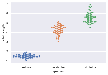
This beautiful representation of data we see above is known as a Swarm Plot with minimal parameters. I shall be covering this in detail later on but for now I just wanted you to have a feel of serenity we’re getting into.
Let us now try to load a random dataset and the one I’ve picked for this illustration is PoliceKillingsUS dataset. This dataset has been prepared by The Washington Post (they keep updating it on runtime) with every fatal shooting in the United States by a police officer in the line of duty since Jan. 1, 2015.
# Loading Pandas DataFrame:
df = pd.read_csv("datasets/PoliceKillingsUS.csv", encoding="windows-1252")
Just the way we looked into Iris Data set, let us know have a preview of this dataset as well. We won’t be getting into deep analysis of this dataset because our agenda is only to visualize the content within. So, let’s do this:
df.head(10)
| id | name | date | manner_of_death | armed | age | gender | race | city | state | signs_of_mental_illness | threat_level | flee | body_camera | |
|---|---|---|---|---|---|---|---|---|---|---|---|---|---|---|
| 0 | 3 | Tim Elliot | 02/01/15 | shot | gun | 53.0 | M | A | Shelton | WA | True | attack | Not fleeing | False |
| 1 | 4 | Lewis Lee Lembke | 02/01/15 | shot | gun | 47.0 | M | W | Aloha | OR | False | attack | Not fleeing | False |
| 2 | 5 | John Paul Quintero | 03/01/15 | shot and Tasered | unarmed | 23.0 | M | H | Wichita | KS | False | other | Not fleeing | False |
| 3 | 8 | Matthew Hoffman | 04/01/15 | shot | toy weapon | 32.0 | M | W | San Francisco | CA | True | attack | Not fleeing | False |
| 4 | 9 | Michael Rodriguez | 04/01/15 | shot | nail gun | 39.0 | M | H | Evans | CO | False | attack | Not fleeing | False |
| 5 | 11 | Kenneth Joe Brown | 04/01/15 | shot | gun | 18.0 | M | W | Guthrie | OK | False | attack | Not fleeing | False |
| 6 | 13 | Kenneth Arnold Buck | 05/01/15 | shot | gun | 22.0 | M | H | Chandler | AZ | False | attack | Car | False |
| 7 | 15 | Brock Nichols | 06/01/15 | shot | gun | 35.0 | M | W | Assaria | KS | False | attack | Not fleeing | False |
| 8 | 16 | Autumn Steele | 06/01/15 | shot | unarmed | 34.0 | F | W | Burlington | IA | False | other | Not fleeing | True |
| 9 | 17 | Leslie Sapp III | 06/01/15 | shot | toy weapon | 47.0 | M | B | Knoxville | PA | False | attack | Not fleeing | False |
This dataset is pretty self-descriptive and has limited number of features (may read as columns).
race:
W: White, non-Hispanic
B: Black, non-Hispanic
A: Asian
N: Native American
H: Hispanic
O: Other
None: unknown
And, gender indicates:
M: Male
F: Female
None: unknown
The threat_level column include incidents where officers or others were shot at, threatened with a gun, attacked with other weapons or physical force, etc. The attack category is meant to flag the highest level of threat. The other and undetermined categories represent all remaining cases. Other includes many incidents where officers or others faced significant threats.
The threat column and the fleeing column are not necessarily related. Also, attacks represent a status immediately before fatal shots by police; while fleeing could begin slightly earlier and involve a chase. Lately, body_camera indicates if an officer was wearing a body camera and it may have recorded some portion of the incident.
Let us now look into the descriptive statistics:
df.describe()
| id | age | |
|---|---|---|
| count | 2535.000000 | 2458.000000 |
| mean | 1445.731755 | 36.605370 |
| std | 794.259490 | 13.030774 |
| min | 3.000000 | 6.000000 |
| 25% | 768.500000 | 26.000000 |
| 50% | 1453.000000 | 34.000000 |
| 75% | 2126.500000 | 45.000000 |
| max | 2822.000000 | 91.000000 |
These stats in particular do not really make much sense. Instead let us try to visualize age of people who were claimed to be armed as per this dataset.
Note: Two special lines of code that we added earlier won’t be required again. As promised, I shall reason that in upcoming lectures.
sns.stripplot(x="armed", y="age", data=df)
<AxesSubplot:xlabel='armed', ylabel='age'>
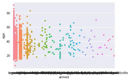
As you would have guessed by now, this plot is known as a Strip plot and pretty ideal for categorical values. Even this shall be dealt in length later on.
I hope these sample plots have intrigued you enough to dive deeper into statistical visual inference with Seaborn. And in next lecture, we shall learn to Control Aesthetics of our plot and few other important aspects.