What is heat map?#
A heat map (or heatmap) is a graphical representation of data where the individual values contained in a matrix are represented as colors. It is a bit like looking a data table from above. It is really useful to display a general view of numerical data, not to extract specific data point. It is quite straight forward to make a heat map, as shown on the examples below. However be careful to understand the underlying mechanisms. You will probably need to normalise your matrix, choose a relevant colour palette, use cluster analysis and thus permute the rows and the columns of the matrix to place similar values near each other according to the clustering.
A heatmap is a plot of rectangular data as a color-encoded matrix. As parameter it takes a 2D dataset. That dataset can be coerced into an ndarray.
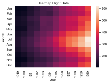
This is a great way to visualize data, because it can show the relation between variabels including time. For instance, the number of fligths through the years.
Various types of heatmap can be found here
import numpy as np
import pandas as pd
import seaborn as sns
import matplotlib.pyplot as plt

%matplotlib inline
heatmap#
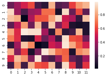
The heatmap plot below is based on random values generated by numpy. Many parameters are possible, this just shows the most basic plot.
# Plot a heatmap for a numpy array:

uniform_data = np.random.rand(10,12)
#uniform_data = np.arange(1,17).reshape(4,4)
sns.heatmap(uniform_data)
<AxesSubplot:>
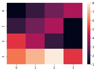
x = np.array([[1,2,3,4],[2,3,4,1],[5,4,2,1],[6,7,8,5]])
sns.heatmap(x)
x
array([[1, 2, 3, 4],
       [2, 3, 4, 1],
       [5, 4, 2, 1],
       [6, 7, 8, 5]])
Three main types of input exist to plot heatmap, let’s study them one by one.
Wide format (untidy)#
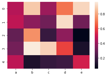
We call ‘wide format‘ or ‘untidy format‘ a matrix where each row is an individual, and each column represents an observation. In this case, a heatmap consists to make a visual representation of the matrix: each square of the heatmap represents a cell. The color of the cell changes following its value.
df = pd.DataFrame(np.random.random((5,5)), columns=["a","b","c","d","e"])

# Default heatmap: just a visualization of this square matrix
p1 = sns.heatmap(df)
heatmap colors#
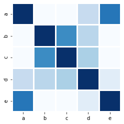
The heatmap colors plot below uses random data again. This time it’s using a different color map (cmap), with the ‘Blues’ palette which as nothing but colors of bue. It also uses square blocks.
corr = df.corr()

ax1 = sns.heatmap(corr, cbar=0, linewidths=2,vmax=1, vmin=0, square=True, cmap='Blues')
plt.show()
heatmap data#
The heatmap data plot is similar, but uses a different color palette. It uses the airline or flights dataset that’s included in seaborn.
sns.set()
flights = sns.load_dataset("flights")
flights = flights.pivot("month", "year", "passengers")
ax = sns.heatmap(flights)
plt.title("Heatmap Flight Data")
plt.show()
In next class we’ll learn Cluster Map