PairGrid#
Welcome to another important lecture on Data Visualization with Seaborn! Today our topic of interest is a PairGrid, which shall be eventually followed up with Pair Plot, that acts a companion function to PairGrid.
PairGrid acts as a very important tool in our arsenal because it returns a subplot grid for plotting pairwise relationships in a dataset. That is more like visualizing correlation between every critical feature of our dataset, depending upon what we choose to plot. The representation ideally has a Histogram plotted across it’s diagonal and Scatterplots forming triangles above and below the diagonal axes.
The technique is often referred to as “Panel Charts” or even, “lattice”, or “trellis” plotting, and it is related to the idea of Small multiples. In general, our objective of using visualizations is to allow us to tap into our brain’s skill at interpreting visual complexity. Human brain is better at interpreting visualizations that use fewer dimensions and by splitting up a big visualization into smaller and simpler visualizations, thus known as “small multiples”, the great skill of our brain, i.e. understanding patterns comes into play.
This visualization concept of Small Multiples was originally introduced by Edward Tufte (I hope I pronounced it correctly!). And he described these as: “Illustrations of postage-stamp size are indexed by category or a label, sequenced over time, like the frames of a movie, or ordered by a quantitative variable, not used in the single image itself.” In simpler words, small multiples use the same basic graphic or chart to display different slices of a Pandas DataFrame, that are rich, multi-dimensional data points, without trying to cram all that information into a single, overly-complex chart.
Now let us try to break-down the important features of PairGrid that comes handy in resolving real-time data:
They display multiple variables with less risk of confusing our audience (be it our clients/stakeholders). Because ideally, trying to draw three or more variables in a single chart is a challenge, that statistician Stephen Few once referred to as overplotting.
Adience can quickly adapt to read an individual chart and apply this knowledge as they scan the rest of the charts. This also shifts our effort from understanding how the chart works, to what the DataFrame says.
Finally we may say that Small multiples enable comparison across variables and reveal the range of potential patterns in our charts.
Now bigger question is to comprehend what we visualize because with any visualization, there are many ways to end up undermining value of the data presentation so let us try to figure out how Seaborn actually makes our life easier.
Once again, we shall import all our package and style dependancies that we’ve constantly been using throughout and then plot a simple PairGrid using a built-in dataset, before getting into our discussion on available parameters.
# Importing dependancies:
import numpy as np
import pandas as pd
np.random.seed(101)
import matplotlib.pyplot as plt
import seaborn as sns
%matplotlib inline
sns.set(style="ticks", palette="ocean")
import warnings
warnings.filterwarnings("ignore")

# Let us also get tableau colors we defined earlier:
tableau_20 = [(31, 119, 180), (174, 199, 232), (255, 127, 14), (255, 187, 120),
         (44, 160, 44), (152, 223, 138), (214, 39, 40), (255, 152, 150),
         (148, 103, 189), (197, 176, 213), (140, 86, 75), (196, 156, 148),
         (227, 119, 194), (247, 182, 210), (127, 127, 127), (199, 199, 199),
         (188, 189, 34), (219, 219, 141), (23, 190, 207), (158, 218, 229)]

# Scaling above RGB values to [0, 1] range, which is Matplotlib acceptable format:
for i in range(len(tableau_20)):
    r, g, b = tableau_20[i]
    tableau_20[i] = (r / 255., g / 255., b / 255.)
Part 1: with Tips dataset#
# Loading Built-in Dataset:
tips = sns.load_dataset("tips")

# Drafting a simple PairGrid plot:
ax = sns.PairGrid(tips)
ax.map(plt.scatter);
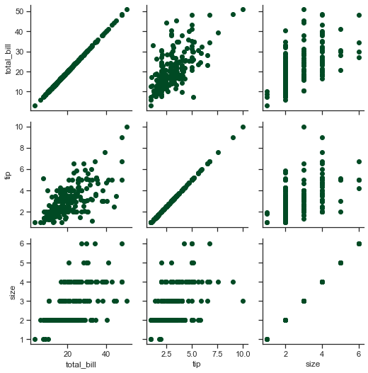
As visible, three important variables from our Tips DataFrame (and yes! we need to ensure that the dataset being inputted is a Pandas DataFrame) have been returned as subplots on this grid, plotted against each other. Even here, at first we initialize our grid, then pass plotting function to a map method, and that in turn gets called on each subplot.
It is also intrinsic to understand the difference between a FacetGrid and a PairGrid. In FacetGrid, each facet shows the same relationship conditioned on different levels of other variables; whereas in PairGrid, each plot shows a different relationship (although as visible, our upper triangle very well epitomizes lower triangle). Using PairGrid, we may fetch a very quick and high-level summary of interesting relationships in our DataFrame.
In a PairGrid, each row and column is assigned to a different variable, so the resulting plot shows each pairwise relationship in our dataset. Note that this style of plot is sometimes also called as a “Scatterplot matrix”, being utmost common way to show each relationship; though it is certainly not limited to Scatterplots, and we shall see that shortly.
Let us now closely look at the parameters offered by Seaborn to aid in plotting PairGrid():
seaborn.PairGrid(data, hue=None, hue_order=None, palette=None, hue_kws=None, vars=None, x_vars=None, y_vars=None, diag_sharey=True, size=2.5, aspect=1, despine=True, dropna=True)
To have a firmer grip on our plot, Seaborn seems to additionally provide us with options like vars, x_vars and y_vars that help us to further determine if we would like consider just a few selective features overall on the plot or on any particular axes. We are well acquainted with rest of the available parameters, so for further customization, we would be using respective plot params, and I shall demonstrate that very shortly. Inference is not actually a pain area for us anymore so let us once again, focus more on varieties available:
# Ensuring visible Edge lines:
plt.rcParams['patch.force_edgecolor'] = True
# Plotting our PairGrid:
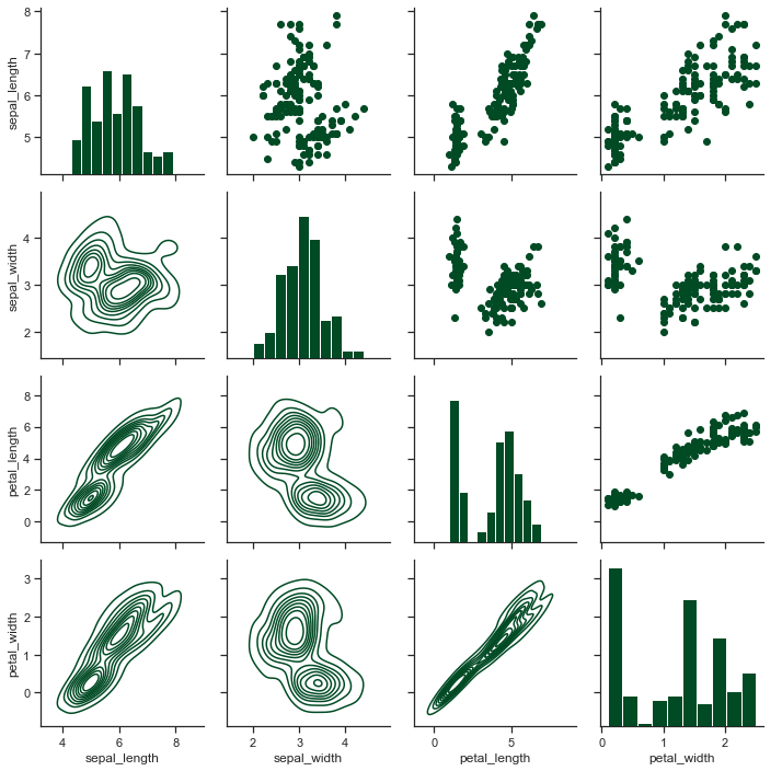
ax1 = sns.PairGrid(tips)
# Let us now map Histogram to diagonals of our grid, & we shall call Matplotlib under cover:
ax1.map_diag(plt.hist, color=tableau_20[5])
ax1.map_offdiag(plt.scatter, color=tableau_20[10])
<seaborn.axisgrid.PairGrid at 0x12c4e273c70>
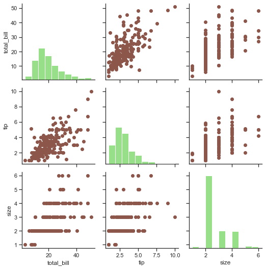
Hmm! That seems to do our job pretty well in presenting correlation between variables. Let us now try to use some other types of plots on some other DataFrame, and this we shall fetch a DataFrame from Scikit-Learn which is actually a Machine Learning library for Python language, featuring various Classification, Regression and Clustering algorithms:
# Generating Data using Sklearn Blobs. Don't really have to focus on data generation:
n = 700
from sklearn.datasets import make_blobs
X, y = make_blobs(n_samples=n, centers=3, n_features=3, random_state=0)

sample = pd.DataFrame(data= np.hstack([X, y[np.newaxis].T]), columns= ['X','Y','Z','model'])

# Distplot has a problem with the color being a number:
sample['model'] = sample['model'].map('model_{}'.format)

list_of_cmaps=['coolwarm','rocket','icefire','winter_r']

ax = sns.PairGrid(sample, hue='model', hue_kws={"cmap":list_of_cmaps}, size=4)

# Now we shall map Scatterplot to Upper & KDE Plot to Lower triangle while Distplot shall take diagonal axes:
ax.map_upper(plt.scatter)
ax.map_lower(sns.kdeplot)
ax.map_diag(sns.distplot)           # ax.map_diag(plt.hist) For a Histogram on diagonals.

# Let us also add a Legend:
ax.add_legend()
<seaborn.axisgrid.PairGrid at 0x12c4cb88d90>
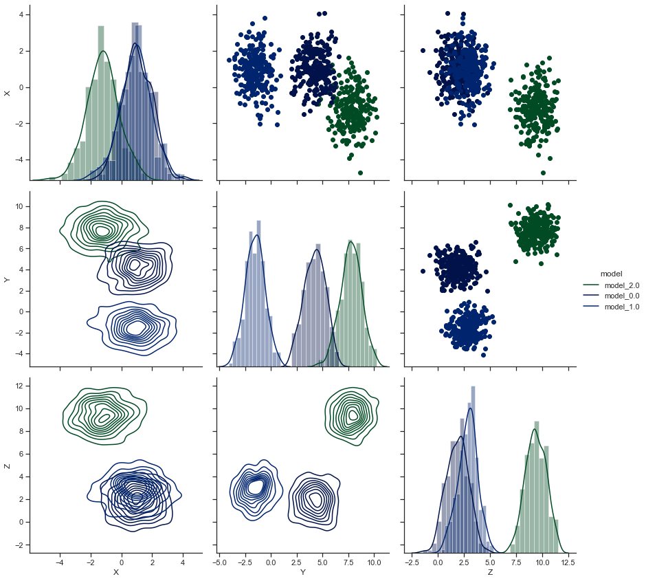
As you have noticed, we may either use .map_offdiag() or just use .map_diag() to refer to the triangles formed above and below the diags, i.e. the diagonals. And we also have the privilege to either map Matplotlib plots or Seaborn plots to our Pairgrid.
Let us now deal with a special case where we have a square grid with identity relationships on the diagonal axes, where we have freedom to plot with different variables in the rows and columns:
# Still working on our "Tips" Dataset:
ax2 = sns.PairGrid(tips, y_vars=["tip"], x_vars=["total_bill", "size"], size=6)

ax2.map(sns.regplot, color='r')
ax2.set(ylim=(-1, 11), yticks=[0, 5, 10])
<seaborn.axisgrid.PairGrid at 0x12c50e26c10>
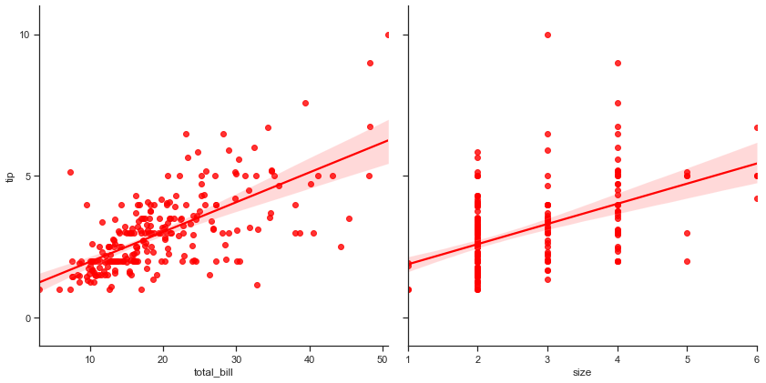
This plot isn’t really something new for us as we have previously seen this while discussing Regplot, but I still wanted you to once again have a look at it.
With that done, let us now move on to another dataset, i.e. Iris dataset
Part 1: with Iris dataset#
Draw a scatterplot for each pairwise relationship#
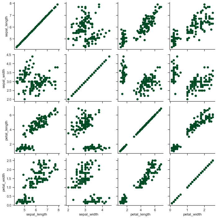
iris = sns.load_dataset("iris")
x = sns.PairGrid(iris)
x = x.map(plt.scatter)
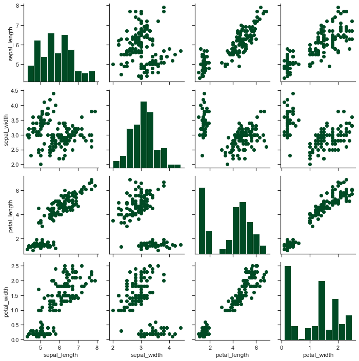
# Show a univariate distribution on the diagonal:
x = sns.PairGrid(iris)
x = x.map_diag(plt.hist)
x = x.map_offdiag(plt.scatter)
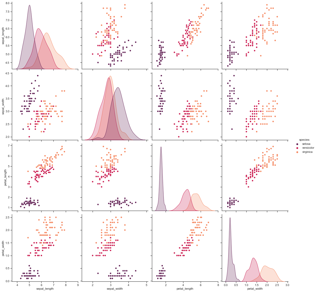
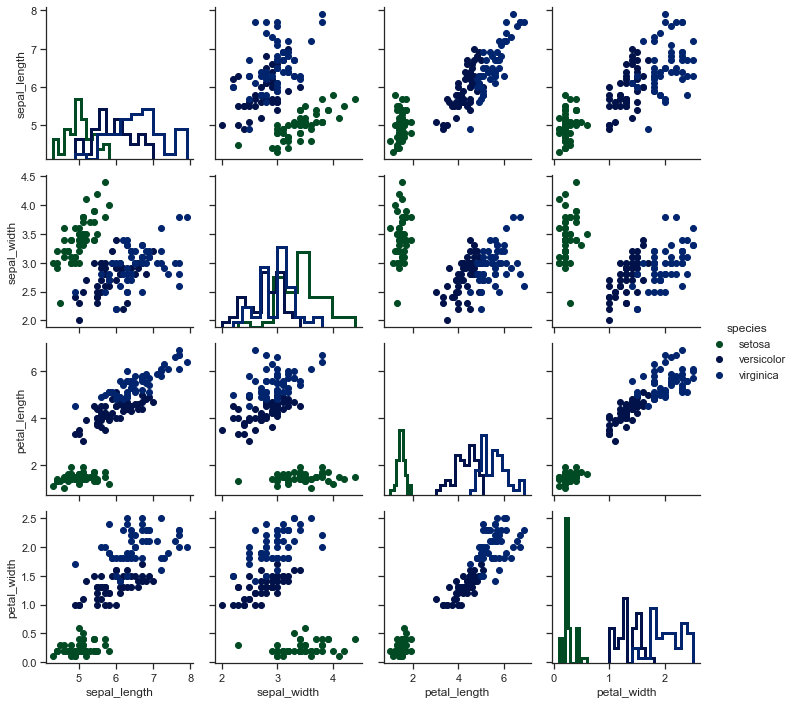
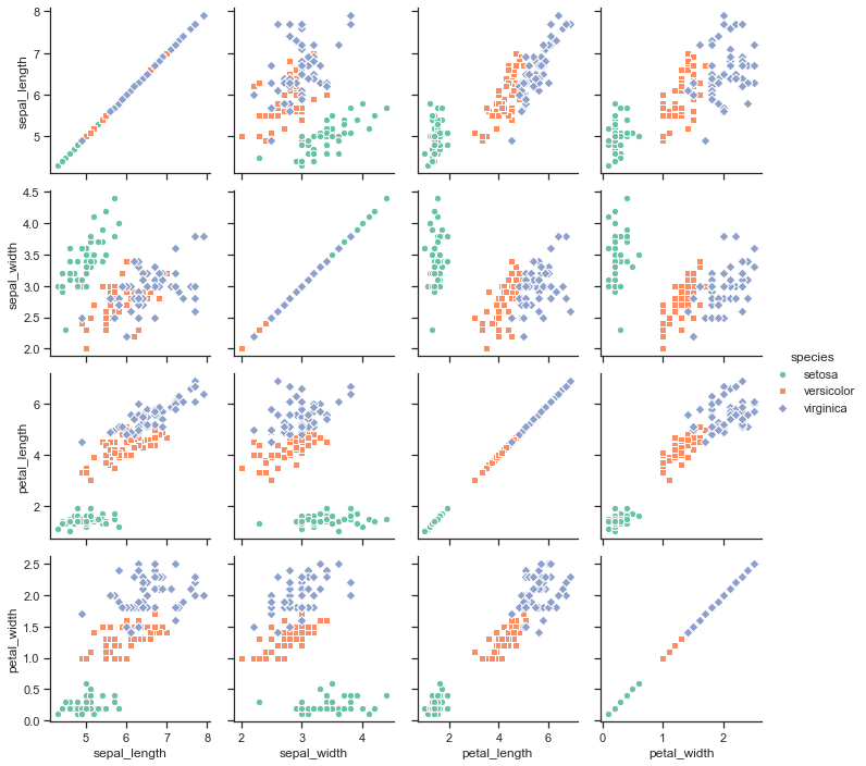
In Iris dataset to get better hue parameter specific plots:
sns.pairplot(iris, hue="species", palette="rocket", diag_kind="kde", size=4)
<seaborn.axisgrid.PairGrid at 0x12c4df5c1c0>
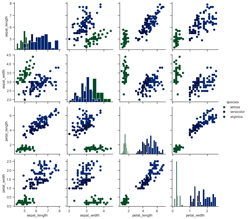
# Color the points using a categorical variable:
x = sns.PairGrid(iris, hue='species')
x = x.map_diag(plt.hist)
x = x.map_offdiag(plt.scatter)
x = x.add_legend()
# Use a different style to show multiple histograms:
x = sns.PairGrid(iris, hue='species')
x = x.map_diag(plt.hist,histtype = 'step',linewidth =3)
x = x.map_offdiag(plt.scatter)
x = x.add_legend()
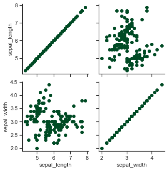
# Plot a subset of variables
x = sns.PairGrid(iris, vars=["sepal_length", "sepal_width"])
x =  x.map(plt.scatter)
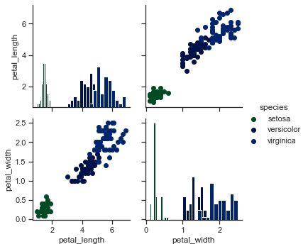
x = sns.PairGrid(iris, hue='species',vars=['petal_length','petal_width'])
x = x.map_diag(plt.hist)
x = x.map_offdiag(plt.scatter)
x = x.add_legend()
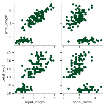
# Use different variables for the rows and columns:
x = sns.PairGrid(iris,x_vars=["sepal_length", "sepal_width"],\
                 y_vars=["petal_length", "petal_width"])
x = x.map(plt.scatter)
## Use different functions on the upper and lower triangles:

x = sns.PairGrid(iris)
x = x.map_diag(plt.hist)
x = x.map_upper(plt.scatter)
x = x.map_lower(sns.kdeplot)
x = x.add_legend()
# Use different colors and markers for each categorical level:

g = sns.PairGrid(iris, hue="species", palette="Set2",
                 hue_kws={"marker": ["o", "s", "D"]})
g = g.map(plt.scatter, linewidths=1, edgecolor="w", s=40)
g = g.add_legend()
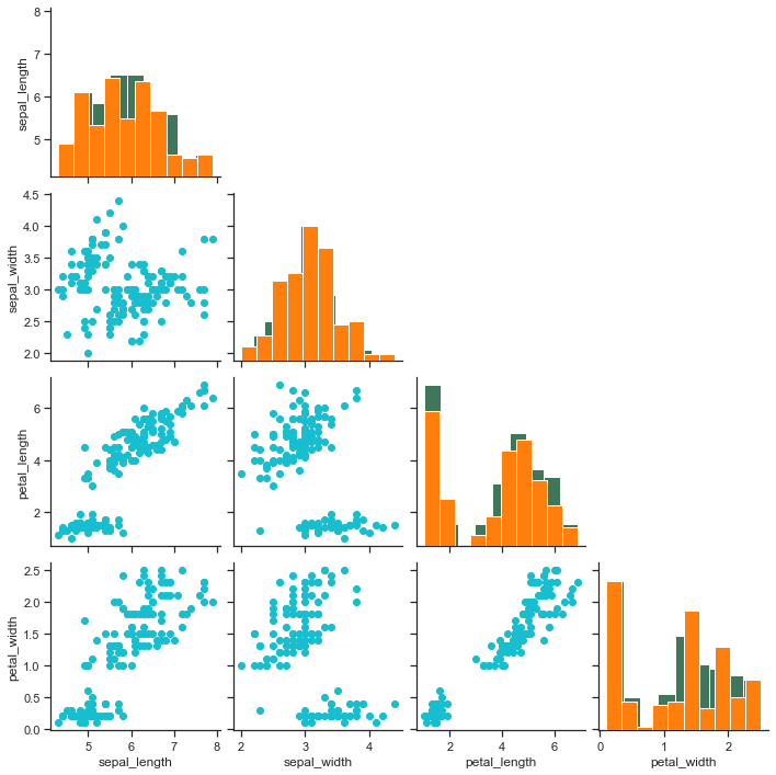
Now how about a requirement where we only wish to draw the lower triangle on our grid thus excluding the area above diagonal axes, because anyways upper is a mirror of lower triangle. Let us try that on our Iris dataset:
# We shall make little use of "NumPy" here:
ax4 = sns.pairplot(iris)
ax4.map_offdiag(plt.scatter, color=tableau_20[18])
ax4.map_diag(plt.hist, color=tableau_20[2])
for i, j in zip(*np.triu_indices_from(ax4.axes, 1)):
    ax4.axes[i, j].set_visible(False)

## Let us have little more fun: Let us now also remove the Diagonals from our Grid:
#for ax in ax4.diag_axes:
    #ax.set_visible(False)
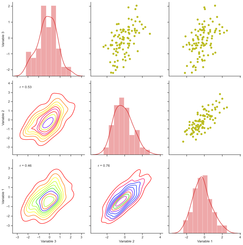
That seems to be a handy option, isn’t it? We don’t know which way the requirements going to flow in, so it is better we remain prepared. Just to keep our learning process versatile enough, let me also show you a simple statistical approach with PairGrids, where we shall try to plot Correlation Coefficient as well for our plot on randon data points:
# Importing another library for statistical assistance:
from scipy import stats

# Declaring few variables to be plotted:
mean = np.zeros(3)
cov = np.random.uniform(.2, .4, (3, 3))
cov += cov.T
cov[np.diag_indices(3)] = 1

# Creating Dataset:
data = np.random.multivariate_normal(mean, cov, 100)
sample = pd.DataFrame(data, columns=["Variable 3", "Variable 2", "Variable 1"])

# Let us create a wrapper function to get our job done:
def corr_func(x, y, **kws):
    r, _ = stats.pearsonr(x, y)
    ax = plt.gca()
    ax.annotate("r = {:.2f}".format(r), xy=(.1, .9), xycoords=ax.transAxes)

ax5 = sns.PairGrid(sample, size=4)
ax5.map_upper(plt.scatter, color=tableau_20[16])
ax5.map_diag(sns.distplot, kde=True, color=tableau_20[6])
ax5.map_lower(sns.kdeplot, cmap="prism")
ax5.map_lower(corr_func)
<seaborn.axisgrid.PairGrid at 0x12c53affc10>
I highly recommend to keep your Seaborn version above 0.8 or else you might face issues with hues on the diagonal of PairGrid.
Let us now plot another PairGrid with some random data points and then try to play with the size of those data points in our Scatterplot:
n = 100
category = pd.DataFrame(np.array(['a', 'b'])[np.random.randint(0, 2, size=[n,1])], columns=["Variables"], dtype="object")
data = pd.DataFrame(np.random.rand(n,2), columns=list('AB'))
sample = pd.concat([data,category], axis=1)

ax6 = sns.PairGrid(sample, hue="Variables", size=4)
ax6.map_diag(plt.hist)
ax6.map_upper(sns.regplot,scatter_kws={'s':10})

def size_func(*args, **kwargs):
    if 'scatter_kws' in kwargs.keys():
        kwargs['scatter_kws'].update({"color": kwargs.pop("color")})
    sns.residplot(*args,**kwargs)

ax6.map_lower(size_func, scatter_kws={'s':10})
<seaborn.axisgrid.PairGrid at 0x12c53a52d60>
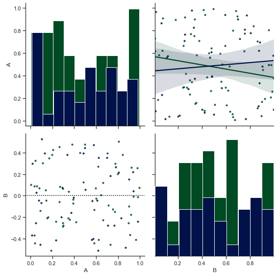
Here, we have been able to get the two classes to be coloured, whilst also being able to change the size of our data points. If I wouldn’t have defined size_func, the two classes of our Residplot wouldn’t be color-separated.
And with that, we shall here end our discussion on PairGrid and in our next lecture, we shall be discussing FacetGrid.