Seaborn: Violin Plot#
Welcome back to another lecture on Seaborn!
Today our topic of interest would be Violin Plot, which pretty much does the job similar to our previously discussed Box Plot with it’s own advantages and disadvantages. Let us at first try to understand what makes Violin plot shine out in Seaborn series of plots.
Sometimes just the Central Tendency isn’t enough to understand a dataset, because it gets difficult to infer, if most of the values are clustered around the median, or are they clustered around the minimum and maximum peaks with actually nothing in the middle. Indeed we may use a Box plot, but then, even those don’t specifically indicate variations in a multi-modal distribution (those with multiple peaks). This is where Seaborn Violin plot comes in handy as a hybrid visualization plot, combining advantages of a Box plot and a KDE (Kernel Densiy Plot).
Violinplots allow to visualize the distribution of a numeric variable for one or several groups. It is really close from a boxplot, but allows a deeper understanding of the density.
Violins are particularly adapted when the amount of data is huge and showing individual observations gets impossible. Seaborn is particularly adapted to realize them through its violin function.
Violinplots are a really convenient way to show the data and would probably deserve more attention compared to boxplot that can sometimes hide features of the data.
In terms of Summary statistics, a Violin Plot pretty much presents stats similar to that of a Box plot. Let us quickly import our dependancies and then look into what a Violin plot holds in stock for us:
Note: backward slash
\is used to write code in next line.
# Importing intrinsic libraries:
import numpy as np
import pandas as pd
np.random.seed(101)
import matplotlib.pyplot as plt
import seaborn as sns
%matplotlib inline
sns.set(style="whitegrid", palette="rainbow")
import warnings
warnings.filterwarnings("ignore")

# Let us also get tableau colors we defined earlier:
tableau_20 = [(31, 119, 180), (174, 199, 232), (255, 127, 14), (255, 187, 120),
         (44, 160, 44), (152, 223, 138), (214, 39, 40), (255, 152, 150),
         (148, 103, 189), (197, 176, 213), (140, 86, 75), (196, 156, 148),
         (227, 119, 194), (247, 182, 210), (127, 127, 127), (199, 199, 199),
         (188, 189, 34), (219, 219, 141), (23, 190, 207), (158, 218, 229)]

# Scaling above RGB values to [0, 1] range, which is Matplotlib acceptable format:
for i in range(len(tableau_20)):
    r, g, b = tableau_20[i]
    tableau_20[i] = (r / 255., g / 255., b / 255.)
# Loading built-in Tips dataset:

tips = sns.load_dataset("tips")
tips.head(7)
| total_bill | tip | sex | smoker | day | time | size | |
|---|---|---|---|---|---|---|---|
| 0 | 16.99 | 1.01 | Female | No | Sun | Dinner | 2 |
| 1 | 10.34 | 1.66 | Male | No | Sun | Dinner | 3 |
| 2 | 21.01 | 3.50 | Male | No | Sun | Dinner | 3 |
| 3 | 23.68 | 3.31 | Male | No | Sun | Dinner | 2 |
| 4 | 24.59 | 3.61 | Female | No | Sun | Dinner | 4 |
| 5 | 25.29 | 4.71 | Male | No | Sun | Dinner | 4 |
| 6 | 8.77 | 2.00 | Male | No | Sun | Dinner | 2 |
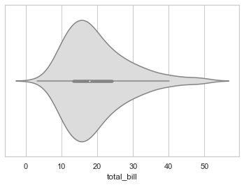
# Plotting basic Violin Plot horizontally:

sns.violinplot(x = tips["total_bill"], palette="coolwarm")
<AxesSubplot:xlabel='total_bill'>
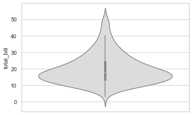
# Plotting basic Violin Plot vertiacally:

sns.violinplot(y = tips["total_bill"], palette="coolwarm")
<AxesSubplot:ylabel='total_bill'>
Anatomy of Violin Plot#
This thick bar that you see at the center (between values 12 and 25) represents the Interquartile Range (that we discussed in previous lecture).
The thin line just above the thick one represents 95% Confidence Interval. In Statistics, a confidence interval is a type of interval estimate that is computed from the observed data. Another term that you might come across is Confidence Level, which is just the frequency of possible our Confidence Intervals, that contain the true value of their corresponding parameter.
And the tiny white dot that you notice at the center of our thick line, is actually the Median.
Finally, the spread that forms this Violin shape is a Kernel Density Estimation to show the distribution shape of the data. Wider sections represent higher probability of members from a sample space (observed data) taking on the given. Skinnier sections represent a lower probability.
So in entirity, it is also one of the best statistical representation offered by Seaborn for visualizing the Probability Density of observed data. That doesn’t change the fact that Violin Plot can be noisier than a Box Plot while showing an abstract representation of each distribution of observations.
Let us now get another basic Violin plot with few more Violins in it. For this single illustration, instead of our typical usage of built-in dataset, this time I shall use a different dataset that I have also attached in the Resources folder for you to access. I have a particular agenda behind this and shall let you know shortly after I plot it. So let us start by getting this dataset and then previewing it:
# Loading University dataset:
university = pd.read_csv("datasets/University.csv")

# Dataset Preview:
university.head(10)
| university_name | total_students | students_enrolled | gender_dominance | education_level | time | |
|---|---|---|---|---|---|---|
| 0 | Harvard | 1582568 | 12587 | Male | High School | Day and Night |
| 1 | Oxford | 1568291 | 54682 | Female | Graduate | Night |
| 2 | Luke | 1822565 | 54808 | Female | Graduate | Day and Night |
| 3 | Cambridge | 785269 | 24865 | Male | Post-Graduate | Day |
| 4 | MIT | 64154651 | 258745 | Female | High School | Day and Night |
| 5 | Xavier's | 6611852 | 5698 | Male | High School | Day |
| 6 | Cornell | 5455131 | 98547 | Male | Graduate | Night |
| 7 | Harvard | 785280 | 42530 | Female | Post-Graduate | Day |
| 8 | Oxford | 2534156 | 22897 | Male | Post-Graduate | Day and Night |
| 9 | Luke | 5425 | 89 | Female | Ph.D | Night |
sns.violinplot(x="university_name", y="total_students", data=university)
<AxesSubplot:xlabel='university_name', ylabel='total_students'>
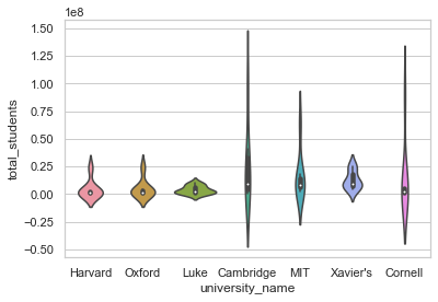
This plot has data observations distributed as per their density, overall it’s Probability distribution is displayed in this plot. If we notice very closely, we shall observe that the X-axis has university_name properly displayed, BUT the Y-axis has values in scientific notation as 1e8, i.e. actually an Exponential form. But we also want our values on Y-Axis to be normally spread out. Another observation would be that the values are negative for total_students, but that is okay for us, as anyways we just want to figure out the spread which certainly can be statistically negative. Before we get into detailing of our Violin plot, let us at first get rid of this exponential form of values. And to do so, we would be required to call underlying Matplotlib Axes class. Let us now see how to use it:
# Removes Scientific notation '1e8'
plt.ticklabel_format(style='plain', axis='y')

# Re-plotting University data:
sns.violinplot(x="university_name", y="total_students", data=university)

# Getting rid of Top and Right spines (just for your 'Styling' revision):
sns.despine()
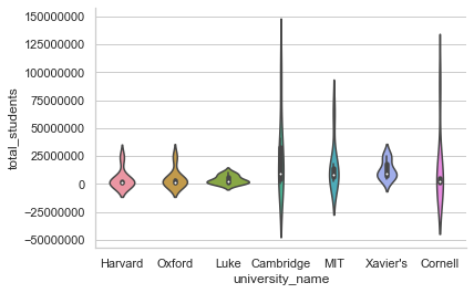
And here it goes! We got rid of the exponential form and have real value range for our dataset. Honestly, this dataset isn’t the best one to practice plots because I created it only to reproduce this particular issue of scientific notation. I have observed multiple times, beginners as well as professionals getting stuck with this inane problem of conversion; so thought of getting you introduced to a solution for this problem.
Let us now get a full list of parameters offered by Seaborn along with Violin Plot:
seaborn.violinplot(x=None, y=None, hue=None, data=None, order=None, hue_order=None, bw='scott', cut=2, scale='area', scale_hue=True, gridsize=100, width=0.8, inner='box', split=False, dodge=True, orient=None, linewidth=None, color=None, palette=None, saturation=0.75, ax=None)
It seems that we do have a couple of new optional parameters here for customization:
First one to catch my attention is
bwparameter which is used to calculate the Kernel density estimator bandwidth. Ideally it is expected to be scalar and by default is set toscott, which we can even alter tosilvermanor another scalar value, that in turn shall call underlying Matplotlibkde.factor. This can also be callable, and if so, it will take a GaussianKDE instance as its only parameter to return a scalar.Next is
cutparameter that represents distance, in units of bandwidth size, to extend the density past the extreme datapoints. Our last plot had negative values because by defaultcutis set to2, so if we add this parameter ascut=0, our violin range in plot shall be restricted within the range of ourUniversitydataset.Next is
scaleparameter which represents the method we’re going to use for scaling width of each violin. By default, it is set to representarea. But we also have options to replace either withcountto scale by number of observations in that bin OR withwidthfor each violin to have same width.Finally, we have
gridsizethat helps us compute Kernel Density Estimate by assigning number of points in the discrete grid.
Let us now try to use all these parameters along with other possible variations. We have already observed KDE and Box Plot previously so conceptually we do not really have anything new here, so let us focus more on visualization in this lecture:
# Loading built-in Tips dataset:
tips = sns.load_dataset("tips")
# Draw a vertical violinplot grouped by a categorical variable:
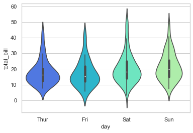
sns.violinplot(x='day', y='total_bill', data=tips)
<AxesSubplot:xlabel='day', ylabel='total_bill'>
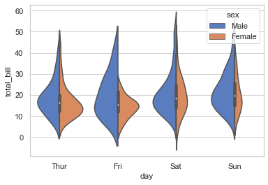
# Draw a violinplot with nested grouping by two categorical variables:
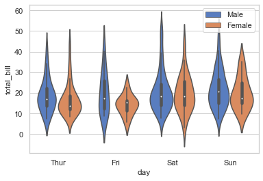
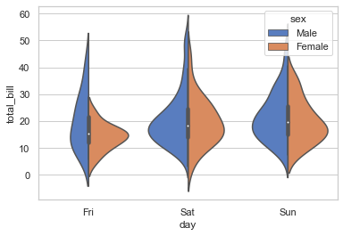
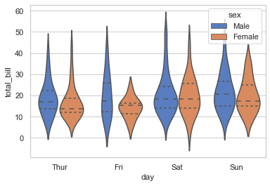
sns.violinplot(x = 'day',y ='total_bill', hue='sex', data=tips, palette='muted')
plt.legend()
<matplotlib.legend.Legend at 0x22c3a5e3ac0>
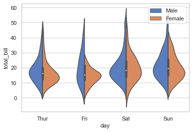
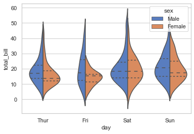
# Draw split violins to compare the across the hue variable:
sns.violinplot(x='day', y='total_bill', hue='sex', data = tips, palette='muted', split=True)
plt.legend()
<matplotlib.legend.Legend at 0x22c3a722fd0>
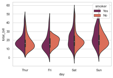
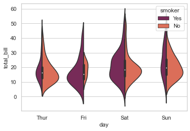
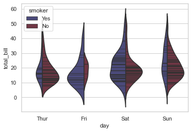
# Making use of 'split' parameter to visualize KDE separately:
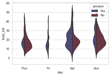
sns.violinplot(x="day", y="total_bill", hue="smoker", data=tips, palette="rocket", split=True)
<AxesSubplot:xlabel='day', ylabel='total_bill'>
# Control violin order by passing an explicit order:
sns.violinplot(x = 'day', y='total_bill', hue='sex', data=tips, palette='muted', split=True, order=['Fri','Sat','Sun'])
<AxesSubplot:xlabel='day', ylabel='total_bill'>
# Let us use 'scale' parameter now:
sns.violinplot(x="day", y="total_bill", hue="smoker", data=tips, palette="rocket", split=True, scale="count")
<AxesSubplot:xlabel='day', ylabel='total_bill'>
# Scale the violin width by the number of observations in each bin:
sns.violinplot(x ='day', y='total_bill', hue='sex', data = tips, palette='muted', split=True,\
               scale = 'count' )
<AxesSubplot:xlabel='day', ylabel='total_bill'>
If you closely observe, you would notice how the spread of Violin range get modified as per the individual bin count that we set as our scale parameter. Let us add little more variation to this plot:
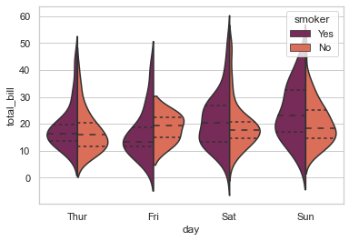
# Let us get our Quartiles visible:
sns.violinplot(x="day", y="total_bill", hue="smoker", data=tips, palette="rocket", split=True, scale="width", inner="quartile")
<AxesSubplot:xlabel='day', ylabel='total_bill'>
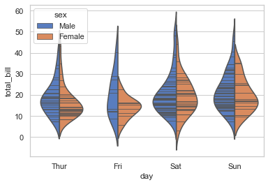
# Draw the quartiles as horizontal lines instead of a mini-box without split :
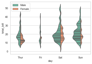
sns.violinplot(x='day', y='total_bill', hue='sex', data=tips, palette='muted', inner='quartile')
<AxesSubplot:xlabel='day', ylabel='total_bill'>
# Draw the quartiles as horizontal lines instead of a mini-box with split:
sns.violinplot(x='day', y='total_bill', hue='sex', data=tips, palette='muted',\
               split=True, inner='quartile')
<AxesSubplot:xlabel='day', ylabel='total_bill'>
So addition of just one more parameter, i.e. inner helps us represent data points within Violin perceptible in the form of it’s Quartiles (as visible in our plot). Alternatively, we may also leave it to default as box; or alter to point and stick. Let us try one more:
# Show each observation with a stick inside the violin:
sns.violinplot(x='day', y='total_bill', hue='sex', data=tips, palette='muted',\
               split=True, inner='stick')
<AxesSubplot:xlabel='day', ylabel='total_bill'>
scale_hue helps in computing scale as per count of arrival of Smokers on each day at the restaurant.
Let us now use a narrower bandwidth to reduce the amount of smoothing of our violin:
sns.violinplot(x="day", y="total_bill", hue="smoker", data=tips, palette="icefire", split=True, scale="count",
               inner="stick", scale_hue=True)
<AxesSubplot:xlabel='day', ylabel='total_bill'>
sns.violinplot(x="day", y="total_bill", hue="smoker", data=tips, palette="icefire", split=True, scale="count",
               inner="quartile", scale_hue=False, bw=.35)
<AxesSubplot:xlabel='day', ylabel='total_bill'>
# Use a narrow bandwidth to reduce the amount of smoothing:

sns.violinplot(x="day", y="total_bill", hue="sex",\
                    data=tips, palette="Set2", split=True,\
                   scale="count", inner="stick",\
                   scale_hue=False, bw=.2)
plt.legend()
<matplotlib.legend.Legend at 0x22c3b278670>
# Draw horizontal violins:
planets_data = sns.load_dataset("planets")
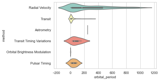
sns.violinplot(x="orbital_period", y="method",\
data=planets_data[planets_data.orbital_period < 1000],\
scale="width", palette="Set3")
<AxesSubplot:xlabel='orbital_period', ylabel='method'>
# Don’t let density extend past extreme values in the data:

sns.violinplot(x="orbital_period", y="method",\
                   data=planets_data[planets_data.orbital_period < 1000],\
                  scale="width", palette="Set3",cut =0)
<AxesSubplot:xlabel='orbital_period', ylabel='method'>
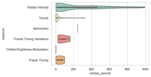
Hmm! That certainly unruffles the density curve at the peak as well at the edges. Let us now try to get this plot segregated based on another variable. As used in previous lectures, we shall once again use Seaborn factorplot to achieve this and add col parameter for separation:
sns.factorplot(x="sex", y="total_bill", hue="smoker", col="time", data=tips, palette="Pastel1", kind="violin",
               split=True, scale="count", size=6, aspect=.6);
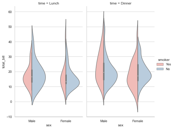
Well this spread looks just the way we wanted it to be. Let us now try to segregate the feed within a single plot:
# Modifying Background Style:
sns.set(style="darkgrid")

# Defining size of subplot ('f' represents Figure & 'ax' represents Axes):
f, ax = plt.subplots(figsize=(8, 8))

# Drafting our Seaborn plot with our defined colors:
sns.violinplot(x="day", y="total_bill", hue="sex", data=tips, palette={"Male": tableau_20[6], "Female": tableau_20[14]})
sns.despine(left=True)

# Using Matplotlib for further customization (Header at Top, X-axis, Y-axis & Legend location on plot):
f.suptitle('Generated Total Bill by Gender', fontsize=18, fontweight='bold')
ax.set_xlabel("Day of Week", size = 14, alpha=0.7)
ax.set_ylabel("Total Bill (USD)", size = 14, alpha=0.7)
plt.legend(loc='upper left')
<matplotlib.legend.Legend at 0x22c3c78df40>
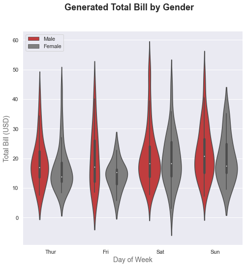
I could have actually plotted this without so much of Matplotlib customization BUT I wanted to simultaneously give you a glimpse of how basic Matplotlib plots work (some of you might be an expert with Matplotlib but am sure it shall help beginners). So I shall quickly run through detailing of the code here: We know that sns.set() helps us change the background. Then we have f and ax which when defined with Matplotlib Subplot, allows us to set a size for the figure and it’s axes.
Then we plot a normal Seaborn Violin plot as done earlier and with left=True, we make all the spines (or axes) invisible. Again we use Matplotlib to add customized headers at top, as well as for both the axes; and finally decide the location for displaying the Legend on the plot.
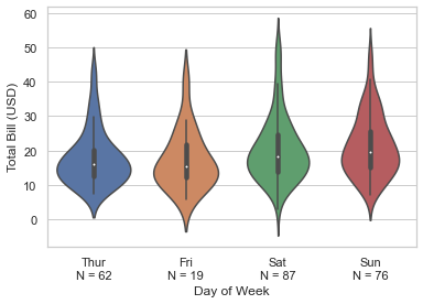
Let us now try to something more; as in try to add statistical summary to annotate plot with number of observations in our Violin plot using the same Tips dataset:
# Modifying background styling:
sns.set_style("whitegrid")

# Heavy use of 'Pandas': Creating temporary functions using Lambda to combine DataFrames for sorting and grouping data
# before I pipeline Violin plot and assign labels:
(sns.load_dataset("tips")
       .assign(count = lambda df: df['day'].map(df.groupby(by=['day'])['total_bill'].count()))
       .assign(grouper = lambda df: df['day'].astype(str) + '\nN = ' + df['count'].astype(str))
       .sort_values(by ='day')
       .pipe((sns.violinplot, 'data'), x="grouper", y="total_bill")
       .set(xlabel='Day of Week', ylabel='Total Bill (USD)'))
[Text(0.5, 0, 'Day of Week'), Text(0, 0.5, 'Total Bill (USD)')]
If you find it difficult understanding the usage of Lambda functions (if not so familiar with Python or Pandas in particular) on DataFrames, the let me try to do this the other way around, and whichever looks simpler to you, you may use whenever required:
# Assigning a variable to our Violin plot:
ax = sns.violinplot(x="day", y="total_bill", data=tips, palette="Paired")

# Calculating value for 'n':
ylist = tips.groupby(['day'])['total_bill'].median().tolist()
xlist = range(len(ylist))
strlist = ['N = 62','N = 19','N = 87','N = 76']

# Adding calculated value as Text to plot:
for i in range(len(strlist)):
    ax.text(xlist[i], ylist[i], strlist[i])
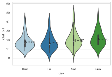
In both the cases, N is just the Number of observations on that particular day. In the second plot, I have tried in fact tried to keep the value inside the plot but didn’t do the same above. The reason is that there might be scenarios where the summary statistics that you’re trying to deduce is so lengthy with details that NEITHER would it look good inside a plot NOR would it fit in, so in those cases, it is preferable to keep them on the axis itself.
Please do remember that Seaborn in itself is just a Visualization package and creates compatibility to accept Statistical packages under it’s hood but for core statistical summary, you will have to call packages like Statsmodels. Though monkey hacks are always available here & there.
Now, let us try to combine little more statistics BUT graphically on top our Violin plot:
sns.set(style="whitegrid", font_scale=1.5)

# Adding a new column (with any two categorical data we want):
tips["sex_time"] = tips[["sex", "time"]].apply(lambda x: "_".join(x), axis=1)

fig, axes = plt.subplots(nrows=2, ncols=1, figsize=(8, 9), sharex=True, gridspec_kw=dict(height_ratios=(1, 3), hspace=0))

# Selection of Order for statistical display:
sns.countplot(x="sex_time", hue="smoker", data=tips, palette="coolwarm",
              order= ["Female_Lunch", "Male_Lunch", "Female_Dinner", "Male_Dinner"], ax=axes[0])

sns.violinplot(x="sex_time", y="total_bill", hue="smoker", data=tips, palette="plasma",
               split=True, scale="count", scale_hue=False, inner="stick",
               order= ["Female_Lunch", "Male_Lunch", "Female_Dinner", "Male_Dinner"], ax=axes[1])

axes[1].set_xticklabels(["Lunch (Female)", "Lunch (Male)", "Dinner (Female)", "Dinner (Male)"])
axes[1].set_xlabel("Time of Day (Gender)")
axes[1].legend("")
<matplotlib.legend.Legend at 0x22c3c8f1040>
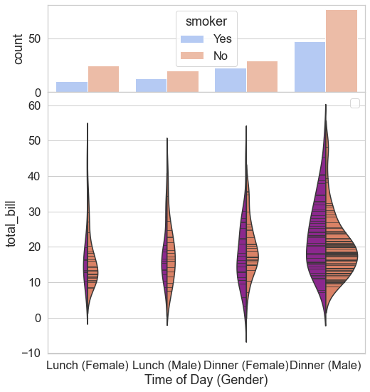
Here we have been able to successfully merge a Countplot on top of a Violin plot, thus a pretty decent match of Count of observations along with the Probability Density. Please note that the limit of customization is endless and I highly encourage you to try. Please make good use of resources online as well as offline to make the most out of it. In our next lecture, we shall be exploring a plot that you would see floating around more than any other plot, i.e. A Bar Plot, Point Plot and Count Plot. Till then, Enjoy Visualizing!