Factor Plot#
Welcome back to another lecture on Data Visualization with Seaborn! This lecture is kind of a continuation to FacetGrid that we had been discussing in previous lecture. Today our major emphasis is once again going to be on plotting Categorical Data.
Well, you might think that we have already done enough of these in previous section, when we covered visualization methods like Swarm Plot, Strip Plot, Box Plot, Violin Plot, Bar Plot and Point Plot. News for you today is that all the above mentioned plots are generally considered low-level methods as they all plot onto a specific pair of Matplotlib axes.
Today we shall discuss a higher level function, i.e. Factor Plot, which combines all the low-level functions with our FacetGrid to apply a Categorical plot across a grid of figure panels on Tidy DataFrame. I shall attach a link in our notebook for you to better assess Tidy Data as defined by official page.
Let us now dive little deeper to understand this high-level Factor Plot; not actually in terms of underlying code but in terms of the conceptual foundation, where it majorly holds relevance to Factor Analysis. To give you an overview, Factor Analysis is again a statistical method that describes variability among observed, correlated variables in terms of a potentially lower number of unobserved variables, which are referred to as Factors.
Factor Analysis searches for similar Joint variations in response to an unobserved set of Latent variables. The term Latent refers to the fact that even though these variables were not measured directly in a research design, still they are the ultimate goal of that project. Hence, the observed variables are modelled as Linear combinations of potential factors, plus “error” terms.
Our Factor analysis aims to find such independent Latent variables and the theory behind these methods is that the Information gained about the inter-dependencies between observed variables can be used later to reduce the set of variables in a dataset. In short, we may say that Factor analysis is related to Principal Component Analysis (PCA), though those two are not identical.
During visualization, A Factor plot simply drafts the same plot generated for different response and factor variables and arranged on a single page. Here, the underlying plot generated can be any Univariate or Bivariate plot, and Scatter Plot serves this purpose quite frequently than others.
Let us now get our package dependancies and plot a simple Factor Plot to understand the parameters offered by Seaborn to make our task easier:
# Importing intrinsic libraries:
import numpy as np
import pandas as pd
np.random.seed(44)
import matplotlib.pyplot as plt
import seaborn as sns
%matplotlib inline
sns.set(style="ticks", palette="hsv")
import warnings
warnings.filterwarnings("ignore")

# Let us also get tableau colors we defined earlier:
tableau_20 = [(31, 119, 180), (174, 199, 232), (255, 127, 14), (255, 187, 120),
         (44, 160, 44), (152, 223, 138), (214, 39, 40), (255, 152, 150),
         (148, 103, 189), (197, 176, 213), (140, 86, 75), (196, 156, 148),
         (227, 119, 194), (247, 182, 210), (127, 127, 127), (199, 199, 199),
         (188, 189, 34), (219, 219, 141), (23, 190, 207), (158, 218, 229)]

# Scaling above RGB values to [0, 1] range, which is Matplotlib acceptable format:
for i in range(len(tableau_20)):
    r, g, b = tableau_20[i]
    tableau_20[i] = (r / 255., g / 255., b / 255.)
# Loading Built-in Dataset:
exercise = sns.load_dataset("exercise")

# Pre-viewing Dataset:
exercise.head(10)
#exercise.columns
| Unnamed: 0 | id | diet | pulse | time | kind | |
|---|---|---|---|---|---|---|
| 0 | 0 | 1 | low fat | 85 | 1 min | rest |
| 1 | 1 | 1 | low fat | 85 | 15 min | rest |
| 2 | 2 | 1 | low fat | 88 | 30 min | rest |
| 3 | 3 | 2 | low fat | 90 | 1 min | rest |
| 4 | 4 | 2 | low fat | 92 | 15 min | rest |
| 5 | 5 | 2 | low fat | 93 | 30 min | rest |
| 6 | 6 | 3 | low fat | 97 | 1 min | rest |
| 7 | 7 | 3 | low fat | 97 | 15 min | rest |
| 8 | 8 | 3 | low fat | 94 | 30 min | rest |
| 9 | 9 | 4 | low fat | 80 | 1 min | rest |
# Creating a basic Factor Plot:
sns.factorplot(x="time", y="pulse", hue="kind", data=exercise, size=6)
<seaborn.axisgrid.FacetGrid at 0x1da1f804700>
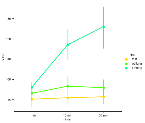
This looks quite informative and we already know how to interpret a Point Plot that we have on screen right now. If an individual is at rest, his/her pulse remains pretty constant at approximately 90, when measured for a time interval from 1 minute to half an hour. Even while walking, the pulse soars high for first 15 minutes, but then stabilizes around 93, and then remains constant at that pulse. But the story is totally different when the individual is running, because the pulse then takes a major upwards leap in first time segment, and constantly keeps pounding with increase in time.
Let us now look at the parameters offered by Seaborn to expand our horizon with Factor Plot:
seaborn.factorplot(x=None, y=None, hue=None, data=None, row=None, col=None, col_wrap=None, estimator=<function mean>, ci=95, n_boot=1000, units=None, order=None, hue_order=None, row_order=None, col_order=None, kind='point', size=4, aspect=1, orient=None, color=None, palette=None, legend=True, legend_out=True, sharex=True, sharey=True, margin_titles=False, facet_kws=None)
The good news is that Seaborn seems to offer almost all the optional parameters that we’ve covered till now; and the other good news is that there isn’t any extra parameter for us to fiddle with. So instead, let us play around with few more Factor Plots to visualize the difference. As of now, we just have a Point Plot on one facet, so we shall eventually even try to draw subplots to get further acquainted with the syntax and corresponding results. There isn’t much we need to do in terms of inference, so let us run through few examples:
# Let us begin by altering the type of plot to a "BarPlot" on our FactorPlot:
sns.factorplot(x="time", y="pulse", hue="kind", data=exercise, size=7, kind="bar", palette="rocket")
<seaborn.axisgrid.FacetGrid at 0x1da1f8bf520>
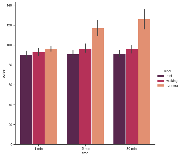
As you would have guessed by now, the kind parameter by default is for Point Plot, but just like this, we may modify it to box, violin, swarm, etc.
Let us now facet our plot along variable columns in the same row:
# For a change, here we shall use a "Box Plot", instead of a "Bar Plot" to visualize the difference:
#sns.factorplot(x="time", y="pulse", hue="kind", col="diet", data=exercise, size=6, kind="box", palette="rocket")

# Let us pull our Legend inside the plot:
sns.factorplot(x="time", y="pulse", hue="kind", col="diet", data=exercise, size=7, kind="box", palette="rocket", legend_out=False)
<seaborn.axisgrid.FacetGrid at 0x1da209c66d0>
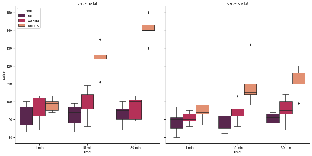
That comfortably divides exercise datapoints with respect to the factor whether they are on low fat or on no fat diet.
Now let us add in few more optional parameters and tweak our presentation, and for this purpose we shall use our Tips dataset, so we shall commence by reloading this built-in dataset:
# factorplot is the most general form of a categorical plot.
#It can take in a kind parameter to adjust the plot type:
# Loading Built-in Tips Dataset:
tips = sns.load_dataset("tips")
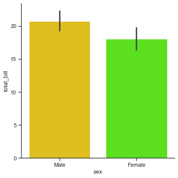
sns.factorplot(x='sex', y='total_bill', data=tips, kind='bar')
<seaborn.axisgrid.FacetGrid at 0x1da20f86b20>
# Let us get all the facets of our grid vertically stacked this time:
sns.factorplot(x="day", y="total_bill", hue="smoker", row="time", data=tips,
               orient="v", size=4, aspect=2.5, palette="bwr", kind="point", dodge=True, cut=0, bw=.2, margin_titles=True)
<seaborn.axisgrid.FacetGrid at 0x1da20fa4c10>
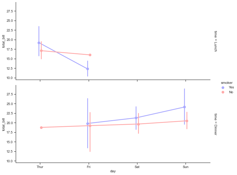
Hmmm! So we have a competent plot here presenting the variations.
Let us now try to extemporize few modifications in our Barplot that we plotted earlier using exercise dataset:
# Let us also assign a variable "ax" to it:
ax = sns.factorplot(x="time", y="pulse", hue="kind", col="diet", data=exercise, size=7, kind="bar",
                    palette="rocket", ci=None)

# Let us now customize it by using methods on our FacetGrid:
ax.set_axis_labels("Time Taken", "Pulse Rate")
ax.set_xticklabels(["1 minute", "15 minutes", "30 minutes"])
ax.set_titles("{col_name} {col_var}")
ax.despine(left=True)
<seaborn.axisgrid.FacetGrid at 0x1da214a06d0>
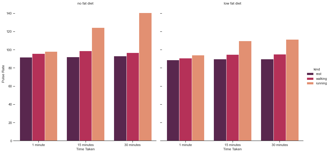
We are pretty familiar with these Matplotlib customizations as we have used these earlier as well. Rest is a Bar Plot representation as set by our kind parameter. And with that, we shall close our discussion for today on Factor Plot.
In the next lecture, we shall try to plot Time Series Data Plot and LetterValue Plot with Seaborn. Till then keep practicing as much as you can using resurces from portals like Kaggle, etc. In fact, in the notebook I shall attach a link to a Resource where you shall find almost everything that can help you with datasets and much more. Specially if you’ve keen interest in Data Science or Machine Learning, that would be worth bookmarking for future use.