Additional Regression Plots#
In this last lecture on visualizing Regression plots, we shall be discussing few other types of plots like Pairplot and revisit additional use cases of plots that we’ve already covered like Lmplot.Since Regression is no new topic for us, let us quickly get into exploring but before we do that, as always we shall make few necessary imports.
# Importing intrinsic libraries

import numpy as np
import pandas as pd
np.random.seed(0)
import matplotlib.pyplot as plt
import seaborn as sns
%matplotlib inline
sns.set(style="ticks", color_codes=True)
import warnings
warnings.filterwarnings("ignore")

# Let us also get tableau colors we defined earlier:
tableau_20 = [(31, 119, 180), (174, 199, 232), (255, 127, 14), (255, 187, 120),
         (44, 160, 44), (152, 223, 138), (214, 39, 40), (255, 152, 150),
         (148, 103, 189), (197, 176, 213), (140, 86, 75), (196, 156, 148),
         (227, 119, 194), (247, 182, 210), (127, 127, 127), (199, 199, 199),
         (188, 189, 34), (219, 219, 141), (23, 190, 207), (158, 218, 229)]

# Scaling avove RGB values to [0, 1] range, which is Matplotlib acceptable format:
for i in range(len(tableau_20)):
    r, g, b = tableau_20[i]
    tableau_20[i] = (r / 255., g / 255., b / 255.)
# Loading Built-in Dataset:
tips = sns.load_dataset("tips")
# tips.head(2)

# Plotting a simple Jointplot:
sns.pairplot(data=tips, hue="sex", palette="icefire", x_vars=["total_bill", "size"], y_vars=["tip"], size=6, aspect=.85, kind="reg")
<seaborn.axisgrid.PairGrid at 0x1662f00ac70>
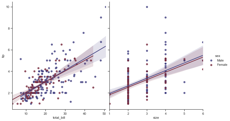
Let us begin with our discussion parameters in this Pairplot:
sns.pairplot(data, hue=None, hue_order=None, palette=None, vars=None, x_vars=None, y_vars=None, kind='scatter', diag_kind='hist', markers=None, size=2.5, aspect=1, dropna=True, plot_kws=None, diag_kws=None, grid_kws=None)
While data parameter helps us in specifying the dataset in Pandas DataFrame, on the other hand, variables x_vars and y_vars are used separately for the rows and columns of the figure; i.e. to make a non-square plot. size determines height, aspect determines width & finally kind determines whether to get Scatter or regression in grids.
And before I proceed further, let me giveaway a set of palette options that you can use with Seaborn. It is not so easy to find all of them listed for you anywhere on internet (atleast I couldn’t find), so I have compiled a list for you guys to play around with and use at your workplace or in your project/assignments for your plots to look awesome. You shall also find attached a Notebook with these color options in your Resource folder, in case you require.
Accent, Accent_r, Blues, Blues_r, BrBG, BrBG_r, BuGn, BuGn_r, BuPu, BuPu_r, CMRmap, CMRmap_r, Dark2, Dark2_r, GnBu, GnBu_r, Greens, Greens_r, Greys, Greys_r, OrRd, OrRd_r, Oranges, Oranges_r, PRGn, PRGn_r, Paired, Paired_r, Pastel1, Pastel1_r, Pastel2, Pastel2_r, PiYG, PiYG_r, PuBu, PuBuGn, PuBuGn_r, PuBu_r, PuOr, PuOr_r, PuRd, PuRd_r, Purples, Purples_r, RdBu, RdBu_r, RdGy, RdGy_r, RdPu, RdPu_r, RdYlBu, RdYlBu_r, RdYlGn, RdYlGn_r, Reds, Reds_r, Set1, Set1_r, Set2, Set2_r, Set3, Set3_r, Spectral, Spectral_r, Wistia, Wistia_r, YlGn, YlGnBu, YlGnBu_r, YlGn_r, YlOrBr, YlOrBr_r, YlOrRd, YlOrRd_r, afmhot, afmhot_r, autumn, autumn_r, binary, binary_r, bone, bone_r, brg, brg_r, bwr, bwr_r, cividis, cividis_r, cool, cool_r, coolwarm, coolwarm_r, copper, copper_r, cubehelix, cubehelix_r, flag, flag_r, gist_earth, gist_earth_r, gist_gray, gist_gray_r, gist_heat, gist_heat_r, gist_ncar, gist_ncar_r, gist_rainbow, gist_rainbow_r, gist_stern, gist_stern_r, gist_yarg, gist_yarg_r, gnuplot, gnuplot2, gnuplot2_r, gnuplot_r, gray, gray_r, hot, hot_r, hsv, hsv_r, icefire, icefire_r, inferno, inferno_r, jet, jet_r, magma, magma_r, mako, mako_r, nipy_spectral, nipy_spectral_r, ocean, ocean_r, pink, pink_r, plasma, plasma_r, prism, prism_r, rainbow, rainbow_r, rocket, rocket_r, seismic, seismic_r, spring, spring_r, summer, summer_r, tab10, tab10_r, tab20, tab20_r, tab20b, tab20b_r, tab20c, tab20c_r, terrain, terrain_r, viridis, viridis_r, vlag, vlag_r, winter, winter_r
Let us now check out Pairplots on a bigger scale and to do that let us get our Iris dataset, just for a change:
iris = sns.load_dataset("iris")
# iris.columns
sns.set(style="dark")

sns.pairplot(iris, hue="species", palette="gist_heat", dropna=True)
<seaborn.axisgrid.PairGrid at 0x16633986eb0>
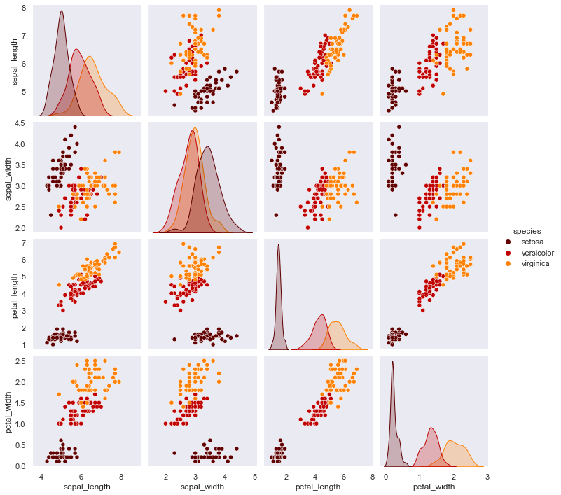
Here what we plot is a grid with 4*4 linear relationship between each feature of our Iris dataset, with visual separation using hue factor of species feature. This is a plot which generally is out first pick for any dataset to understand the correlation on a single grid. You may notice Histograms being plotted diagonally when the features are correlated with each other. Rest of the individual plots remain to be Scatterplots that we discussed in detail earlier as well. There is a legend indicating the separation based on the color. The axes have ticks because earlier we had set the style so.
Let me also give you a preview to something known as Pairgrid which is actually the basis of our Pairplot. So, we are going to just look at it as of now and feel the difference or better to say, we’re just going to explore the potential of Pairplot for now and then delve deeper into PairGrid later in this course. And, to this we shall conttinue on our Iris dataset:
from itertools import cycle
sns.set(style="dark")

def make_kde(*args, **kwargs):
    sns.kdeplot(*args, cmap=next(make_kde.cmap_cycle), **kwargs)

make_kde.cmap_cycle = cycle(('coolwarm', 'Wistia', 'icefire'))

our_plot = sns.PairGrid(iris, vars=('sepal_length', 'sepal_width', 'petal_length'), hue='species', dropna=True)
our_plot.map_diag(sns.kdeplot)
our_plot.map_lower(make_kde)
our_plot.map_upper(plt.scatter)
<seaborn.axisgrid.PairGrid at 0x166339f84c0>
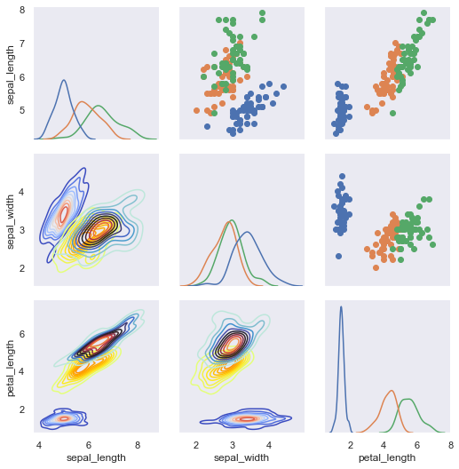
To give you a fair bit of an idea, here we cycled through the list of color maps stored in the cmap_cycle attribute attached to the make_kde function. And Python programmers know that this isn’t actually the best way to use function attributes, so that bit of customization I shall leave as a homework. Overall it helps us achieve a pair-wise relationship between features using PairGrid and Pairplot; and simultaneously allows us to plot different types of plot like Kernel Density Contours, Scatterplot, etc. for our needs.
Residplot()#
So now let us quickly cover a very small topic here, i.e. Residplot and once done with this, I shall again show you a small demo of PairGrid, and include Residplot in this one. So, let’s plot our first Residplot and understand wat it does for us.
And this time let us generate some random data using our function we previously created in the very first lecture of Linear Regression plots. If you can’t recollect, it is okay, as I am going to paste the code here as well for your reference.
def generatingData():
    num_points =1500
    category_points =[]

    for i in range(num_points):
        if np.random.random()>0.5:
            x,y = np.random.normal(0.0, 0.9), np.random.normal(0.0, 0.9)
            category_points.append([x,y])
        else:
            x, y = np.random.normal(3.0, 0.5), np.random.normal(1.0, 0.5)
            category_points.append([x, y])

    df =pd.DataFrame({'x':[v[0] for v in category_points], 'y':
                      [v[1] for v in category_points]})

    sns.residplot('x', 'y', data=df, lowess=True, color="r")
    plt.show()
sns.set(style="whitegrid")

generatingData()
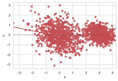
This Residplot is a plot of the residuals after fitting a linear model. This function is something we had established in our previous lecture of Matplotlib v/s Seaborn so all we need to alter is the type of model we want, along with lowess parameter. If lowess parameter is set to TRUE, then it uses statsmodels to estimate a nonparametric lowess model, indicating a locally weighted linear regression model.
Important to note is that confidence intervals cannot currently be drawn for this kind of model or even for Regplot.
There isn’t much to talk about Residplot and it isn’t quite often that you are going to use them in production, (at least I haven’t used till date) but it is again good to know what Seaborn has in stock to offer. So as promised let me show you another example of PairGrid with reference to Residplot as it shall help you implement if ever required in your work. Again, we shall be not discussing in detail and instead just try to focus on visualization aspect of it. Let’s plot:
np.random.seed(42)

sample = 100
categories = pd.DataFrame(np.array(["p","q"])[np.random.randint(0,2,size=[sample,1])], columns=["cat"], dtype="object")
data = pd.DataFrame(np.random.rand(sample, 2), columns=list('AB'))
df = pd.concat([data,categories], axis=1)

g = sns.PairGrid(df, hue="cat")
g.map_diag(plt.hist)

g.map_upper(sns.regplot, scatter_kws={'s':10})

def f(*args, **kwargs):
    if 'scatter_kws' in kwargs.keys():
        kwargs['scatter_kws'].update({"color": kwargs.pop("color")})
    sns.residplot(*args,**kwargs)
g.map_lower(f, scatter_kws={'s':10})
<seaborn.axisgrid.PairGrid at 0x16635a26b80>
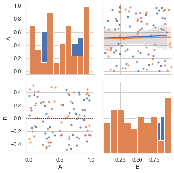
Here we generate some random data and create a pairplot of it, ensuring a smaller than default size of our data points which also have separate color coding.
Now, let us try to use built-in Anscombe’s dataset to create a linear regression plot on these quartet grid; and to achieve this we’re going to use what you’re already familiar with, i.e. Lmplot()
df = sns.load_dataset("anscombe")

sns.lmplot(x="x", y="y", col="dataset", hue="dataset", data=df, col_wrap=2, ci=None, palette="spring", size=3.5, scatter_kws={"s": 60, "alpha": 1})
<seaborn.axisgrid.FacetGrid at 0x16635a63550>
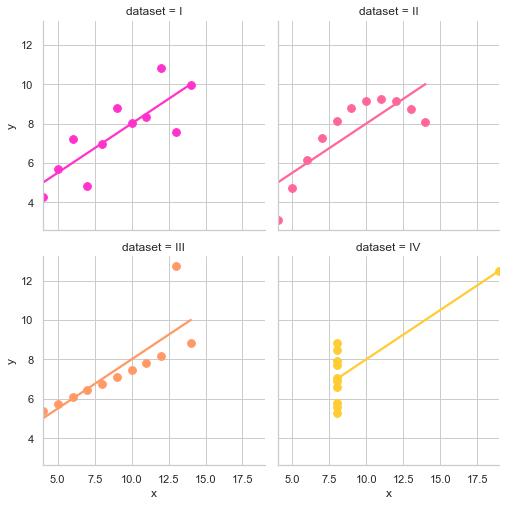
With this quartet, we have a result of the results of a linear regression within each dataset. If you urge to explore the dataset more, feel free to load it and check various other possibilities to wrangle; and honestly I shall highly recommend it as well because there is no better way of learning.
We’re going to end this lecture here and this pretty much brings us to the end of Linear Regression possibilities in general. I hope you are enjoying the shine and mileage that Seaborn adds to our presentation and hope to see you soon in our next lecture where we shall be discussing few other plots which deal quite heavily with Distribution Data Plots, that is commonly seen across.