Seaborn: Categorical Data Plots#
Categorical Data Background#
Hello guys! You have been doing a fabulous job as we’ve already covered a major segment of plotting with our previous set of lectures. Till now we have used regression techniques and majorly dealt with all possible parameters and data types. Now our concentration is going to be little more on categorical data. It isn’t that we have not gone through categorical data till now but you certainly remember that on multiple occassions, we were generating random numbers with custom codes.
So, let us begin with the intuition behind categorical data and slowly and steady with this and upcoming lectures, we shall focus more on each type of plot that does shines out for Seaborn, when dealing with Categorical data.
Categorical features represent types of data which may be divided into groups. Examples of categorical variables could be something like race, sex, or even educational and professional details. While educational variable may also be considered in a numerical manner by using exact values for highest grade completed, it is often more informative to categorize such variables into a relatively small number of groups.
Analysis of categorical data generally involves the use of data tables. A two-way table is very common & presents categorical data by counting the number of observations that fall into each group for two variables, one divided into rows and the other divided into columns. This shall get more evident when we start plotting.
It would be nice to remember that the totals for each category are also known as marginal distributions, that provide the number of individuals in each row or column; without accounting for the effect of the other variable. And, since simple counts are often difficult to analyze, two-way tables are often converted into percentages.
The best representation that we can have for such a calculation would be a segmented bar graph depicting the breakdown of features, where segments of each bar are color-coded to correspond to the appropriate variable. This is exactly what we shall be doing throughout in different styles to suit our requirements.
Now let’s discuss using seaborn to plot categorical data! There are a few main plot types for this:
swarmplot()stripplot()boxplot()violinplot()barplot()pointplot()countplot()factorplot()
Let us now closely look at what Seaborn has to offer. Their structure of plots are majorly divided into three segments and that is what we shall cover in this as well as upcoming two lectures:
swarmplot()andstripplot()that show each observation at each level of the categorical variable.boxplot()andviolinplot()that show an abstract representation of each distribution of observations.barplot(),pointplot()andcountplot()that apply a statistical estimation to show a measure of Central Tendency and Confidence Interval.fatorplot()is the most general form of a categorical plot. It can take in akindparameter to adjust the plot type.
Swarm Plot#
In this lecture, we shall be discussing the first variety and without further delay, now I shall plot a swarmplot() so that we can start our discussion.
# Importing intrinsic libraries:
import numpy as np
import pandas as pd
np.random.seed(0)
import matplotlib.pyplot as plt
import seaborn as sns
%matplotlib inline
sns.set(style="darkgrid", palette="icefire")
import warnings
warnings.filterwarnings("ignore")

# Let us also get tableau colors we defined earlier:
tableau_20 = [(31, 119, 180), (174, 199, 232), (255, 127, 14), (255, 187, 120),
         (44, 160, 44), (152, 223, 138), (214, 39, 40), (255, 152, 150),
         (148, 103, 189), (197, 176, 213), (140, 86, 75), (196, 156, 148),
         (227, 119, 194), (247, 182, 210), (127, 127, 127), (199, 199, 199),
         (188, 189, 34), (219, 219, 141), (23, 190, 207), (158, 218, 229)]

# Scaling above RGB values to [0, 1] range, which is Matplotlib acceptable format:
for i in range(len(tableau_20)):
    r, g, b = tableau_20[i]
    tableau_20[i] = (r / 255., g / 255., b / 255.)
# Loading Iris dataset
iris = sns.load_dataset("iris")

# Melt dataset to 'long-form' or 'tidy' representation:
iris = pd.melt(iris, "species", var_name="measurement")

# Drawing a categorical scatterplot to show each observation
sns.swarmplot(x="measurement", y="value", hue="species", data=iris)
<AxesSubplot:xlabel='measurement', ylabel='value'>
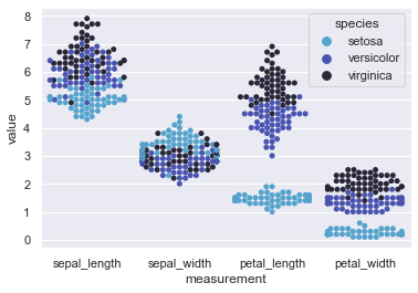
This plot is a scattered representation of non-overlapping points of the three species of Iris flower with difference in values of their sepal length, sepal width, petal length and petal width.
We could have plotted a Scatterplot instead but the size of dots are comparitively bigger and when the dataset gets bigger and bigger, this bee swarm gets more convenient to use. Here, we may easily visualize that Setosa sepal length is smaller than Versicolor and Virginica but their width is more than the other two. Pretty much same case in terms of petal length as well but this time even the width of petals remain smaller than rest two varities of Iris flower.
Seaborn accepts a set of parameters apart from what mandatory parameters that we see in our code so let us go through those:
seaborn.swarmplot(x=None, y=None, hue=None, data=None, order=None, hue_order=None, dodge=False, orient=None, color=None, palette=None, size=5, edgecolor='gray', linewidth=0, ax=None)
As we know, here x and y are expected to be name of our variables in data, and same holds good for hue parameter as well. data indicates our dataset. Officially, Swarmplot accepts input data in a variety of formats, like:
Vectors of data represented as Lists, NumPy arrays, or Pandas Series object for
x,y, and/orhueparameter.A long-form DataFrame, where data point plotting is determined by
x,yandhuevariables.A wide-form DataFrame, such that each numeric column gets plotted.
Anything accepted by plt.boxplot (e.g. a 2d array or list of vectors)
The conversion of wide to long or from long to wide is always a one line code as we noticed above. Just to give you an idea, apart from .melt() function, Pandas also offer other functions like .wide_to_long() that does the job for us. Moving on to optional parameters, we have few important ones like orient that helps us alter the orientation of our plot to either vertical or horizontal. We also have split parameter which gets handy when we’re applying hue parameter to our plot. Ideally, split is set to False, but if set to True, then it separates the strip for different hue levels along the categorical axis.
Let us quickly use these optional parameters on our previous plot to get a feel of it:
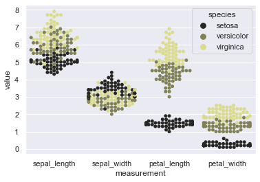
sns.swarmplot(x="measurement", y="value", hue="species", data=iris, orient='v', color=tableau_20[17], size=5)
<AxesSubplot:xlabel='measurement', ylabel='value'>
We may even change the order of the categorical variables being on our X-axis. Let us try that:
sns.swarmplot(x="measurement", y="value", hue="species", order=['sepal_width','petal_width','sepal_length','petal_length'], data=iris, color=tableau_20[17], size=5)
<AxesSubplot:xlabel='measurement', ylabel='value'>
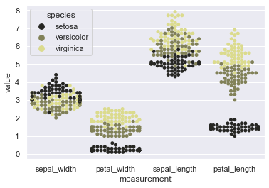
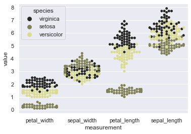
This makes our job easy when dataset is really huge and we need to compare few similar variables. Drag them side-by-side and visualize the difference for further analysis. Alteration of hue_order also gets quite handy. In our current plot, we notice black color for Setosa as a prominent separator so why not get it in the middle to ensure enhanced visual separation of data points. Let’s do that!
sns.swarmplot(x="measurement", y="value", hue="species", order=['petal_width','sepal_width','petal_length','sepal_length'],
              hue_order=['virginica','setosa','versicolor'], data=iris, color=tableau_20[17], size=5)
<AxesSubplot:xlabel='measurement', ylabel='value'>
Okay! We’re done with parameter tweaking so let us now move on to use another Seaborn attribute for plotting our beeswarms on separate axes. This attribute is known as Factorplot and we shall discuss it majorly in the later section of the course BUT for now we shall just use it to get more mileage from our Swarmplot.
Little tired of Iris flower sets! Let us use our Tips dataset this time around.
# Loading Tips dataset:
tips = sns.load_dataset("tips")

sns.factorplot(x="sex", y="total_bill", hue="smoker", col="time", data=tips, kind="swarm", size=4.5, aspect=.7, palette="rocket");
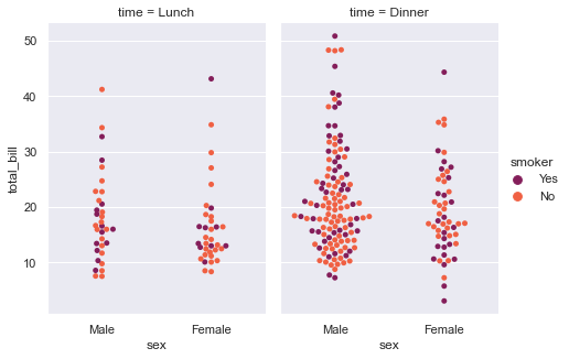
Factorplot has given us the flexibility to visualize our dataset, i.e. Tips dataset, in two separate segments within a single plot, segregated by the time of day. So the first set of axes help us understand the trend during Lunch time and on right, we get a set of axes for Dinner time. hue parameter reflects the palette parameter, which in turn displays data points in separate colors, where smokers are presented by purple color. With such a presentation, it gets easier to see the bulk of customers on basis of their Gender, the total bill that their arrival in the restaurant generates.
More often you shall find that it is never a Swarmplot that alone represents those data points, as it is generally combined with Boxplot or Violinplots, that we shall discuss in-depth later on in this course.
I won’t get into great detail but will show you a simple way of mixing these Swarmplots with other plot. Let me use a Boxplot to demonstrate what I mean and as assured earlier, I will cover Boxplots later in much more depth with all it’s parameters and general use-cases:
sns.swarmplot(x="day", y="total_bill", data=tips, palette="rocket")
sns.boxplot(x="day", y="total_bill", data=tips,
        showcaps=True, boxprops={'facecolor':tableau_20[1]},
        showfliers=False, whiskerprops={'linewidth':0})
<AxesSubplot:xlabel='day', ylabel='total_bill'>
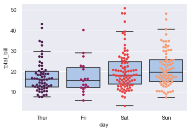
It is the width of our beeswarm in the plot that matters, and is governed by the number of data points which are close together without overlapping.
You might not be able to correlate to it much because we haven’t covered topics like Boxplot or Violinplot as of now. So, let me actually mix our Swarmplot with something that we’ve already covered to get a better idea. We shall generate some random data and use Linear Regression visualization technique that we learnt in previous lectures:
# Generating random data:
n= 19; m= 9
y_data = []
for i in range(m):
    a =  (np.random.poisson(lam=0.99 - float(i)/m, size=n) + i * 0.9 + np.random.rand(1)*2)
    a += (np.random.rand(n) -0.5) * 2
    y_data.append(a*m)

y_data = np.array(y_data).flatten()
x_data = np.floor(np.sort(np.random.rand(n*m)) * m)

# Creating a Pandas DataFrame out of those:
sample = pd.DataFrame({'x': x_data, 'y': y_data})

# Shall experiment mixing with Regplot:
sns.regplot(y= 'y', x= 'x', data= sample, color= tableau_20[10], scatter_kws= {"alpha" : 0.2})
sns.swarmplot(x= 'x', y= 'y', data= sample, palette= 'nipy_spectral_r')
<AxesSubplot:xlabel='x', ylabel='y'>
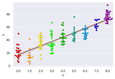
I am sure few of you would prefer your regplot to have beeswarm scattering like this plot than complete Scatterplot but in my honest opinion, the choice varies with dataset and our objective with it.
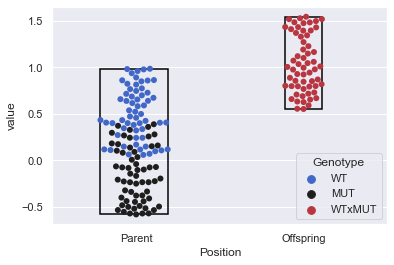
I shall now show you another handy way of crafting Seaborn Swarmplots where you could get the datapoint span covered within the plots. Let me show you what I mean by generating some random data for it. We shall also make small use of underlying Matplotlib patches class to get a shape for our span.
In due course of getting our Swarm limits, we need to remember that Swarmplot actually returns the Matplotlib Axes instance, and from there we can find the PathCollections that it creates. To get precise datapoint positions, we will use .get_offsets() function provided by Matplotlib.
# Fetching Matplotlib dependancy:
from matplotlib.patches import Rectangle

# Generating random data:
a = np.random.random(60)
b = np.random.random(60) - 0.6
c = np.random.random(60) + 0.55

# Let us now melt these datapoints into a DataFrame:
sample = pd.DataFrame({'a1': a, 'a2': b, 'a3': c})
sample.columns = [list(['WT', 'MUT', 'WTxMUT']), list(['Parent', 'Parent', 'Offspring'])]
sample.columns.names = ['Genotype', 'Position']
sample_melt = pd.melt(sample)

ax = sns.swarmplot(data=sample_melt, x='Position', y='value', hue='Genotype', palette='icefire', size=6)

# Defining Function for transposing data with statistical computations and shape:
def getdatalim(col_l):
    x,y = np.array(col_l.get_offsets()).T
    try:
        print ('xmin={}, xmax={}, ymin={}, ymax={}'.format(x.min(), x.max(), y.min(), y.max()))
        rect = Rectangle((x.min(),y.min()),x.ptp(),y.ptp(), edgecolor='k', facecolor= 'None', lw=1.5)
        ax.add_patch(rect)
    except ValueError:
        pass

getdatalim(ax.collections[0])       # For 'Parents' on X-Axis
getdatalim(ax.collections[1])       # For 'Offspring' on X-Axis
xmin=-0.21330910940589698, xmax=0.1882615260180538, ymin=-0.5808771025513102, ymax=0.9834262422606419
xmin=0.8904402624046048, xmax=1.1095522857580948, ymin=0.5513833499989991, ymax=1.5418903291546293
Now that we’ve seen enough variations with swarmplot() application, let us move on to discuss our next type of plot, that again does a decent job in showing each observation at each level of the categorical variable. These plots are known as Strip Plot, and we shall discuss it in length in our next lecture.
Till then, I would highly recommend to play around with these plots as much as you can and if you have any doubts, feel free to post in the forum. Also, it would be nice if you could take out a minute of your time to leave a review or at least rate this course using Course Dashboard; because that shall help other students gauge if this course is worth their time and money.