What is Distribution Plots?#
Flexibly plot a univariate distribution of observations.
This function combines the matplotlib hist function (with automatic calculation of a good default bin size) with the seaborn
kdeplot()andrugplot()functions. It can also fit scipy.stats distributions and plot the estimated PDF over the data.
Let’s discuss some plots that allow us to visualize the distribution of a dataset. These plots are:#
distplot()jointplot()pairplot()rugplot()kdeplot()
import numpy as np
import matplotlib.pyplot as plt
import seaborn as sns
import pandas as pd
%matplotlib inline
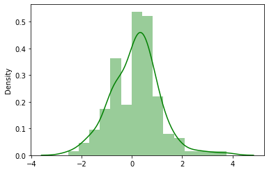
num = np.random.randn(150)
sns.distplot(num,color ='green')
C:\ProgramData\Anaconda3\lib\site-packages\seaborn\distributions.py:2557: FutureWarning: `distplot` is a deprecated function and will be removed in a future version. Please adapt your code to use either `displot` (a figure-level function with similar flexibility) or `histplot` (an axes-level function for histograms).
  warnings.warn(msg, FutureWarning)
<AxesSubplot:ylabel='Density'>
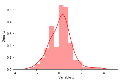
label_dist = pd.Series(num,name = " Variable x")
sns.distplot(label_dist,color = "red")
C:\ProgramData\Anaconda3\lib\site-packages\seaborn\distributions.py:2557: FutureWarning: `distplot` is a deprecated function and will be removed in a future version. Please adapt your code to use either `displot` (a figure-level function with similar flexibility) or `histplot` (an axes-level function for histograms).
  warnings.warn(msg, FutureWarning)
<AxesSubplot:xlabel=' Variable x', ylabel='Density'>
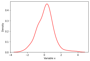
# Plot the distribution with a kenel density. estimate and rug plot:

sns.distplot(label_dist,hist = False,color = "red")
C:\ProgramData\Anaconda3\lib\site-packages\seaborn\distributions.py:2557: FutureWarning: `distplot` is a deprecated function and will be removed in a future version. Please adapt your code to use either `displot` (a figure-level function with similar flexibility) or `kdeplot` (an axes-level function for kernel density plots).
  warnings.warn(msg, FutureWarning)
<AxesSubplot:xlabel=' Variable x', ylabel='Density'>
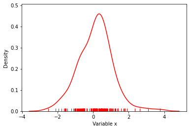
# Plot the distribution with a kenel density estimate and rug plot:

sns.distplot(label_dist,rug = True,hist = False,color = "red")
C:\ProgramData\Anaconda3\lib\site-packages\seaborn\distributions.py:2557: FutureWarning: `distplot` is a deprecated function and will be removed in a future version. Please adapt your code to use either `displot` (a figure-level function with similar flexibility) or `kdeplot` (an axes-level function for kernel density plots).
  warnings.warn(msg, FutureWarning)
C:\ProgramData\Anaconda3\lib\site-packages\seaborn\distributions.py:2056: FutureWarning: The `axis` variable is no longer used and will be removed. Instead, assign variables directly to `x` or `y`.
  warnings.warn(msg, FutureWarning)
<AxesSubplot:xlabel=' Variable x', ylabel='Density'>
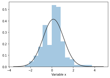
# Plot the distribution with a histogram and maximum likelihood gaussian distribution fit:

from scipy.stats import norm
sns.distplot(label_dist, fit=norm, kde=False)
C:\ProgramData\Anaconda3\lib\site-packages\seaborn\distributions.py:2557: FutureWarning: `distplot` is a deprecated function and will be removed in a future version. Please adapt your code to use either `displot` (a figure-level function with similar flexibility) or `histplot` (an axes-level function for histograms).
  warnings.warn(msg, FutureWarning)
<AxesSubplot:xlabel=' Variable x'>
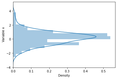
Plot the distribution on the vertical axis:#
sns.distplot(label_dist, vertical =True)
C:\ProgramData\Anaconda3\lib\site-packages\seaborn\distributions.py:2557: FutureWarning: `distplot` is a deprecated function and will be removed in a future version. Please adapt your code to use either `displot` (a figure-level function with similar flexibility) or `histplot` (an axes-level function for histograms).
  warnings.warn(msg, FutureWarning)
C:\ProgramData\Anaconda3\lib\site-packages\seaborn\distributions.py:1647: FutureWarning: The `vertical` parameter is deprecated and will be removed in a future version. Assign the data to the `y` variable instead.
  warnings.warn(msg, FutureWarning)
<AxesSubplot:xlabel='Density', ylabel=' Variable x'>
Let’s implement with dataset#
Data#
Seaborn comes with built-in data sets!
tips = sns.load_dataset('tips')
tips.head()
| total_bill | tip | sex | smoker | day | time | size | |
|---|---|---|---|---|---|---|---|
| 0 | 16.99 | 1.01 | Female | No | Sun | Dinner | 2 |
| 1 | 10.34 | 1.66 | Male | No | Sun | Dinner | 3 |
| 2 | 21.01 | 3.50 | Male | No | Sun | Dinner | 3 |
| 3 | 23.68 | 3.31 | Male | No | Sun | Dinner | 2 |
| 4 | 24.59 | 3.61 | Female | No | Sun | Dinner | 4 |
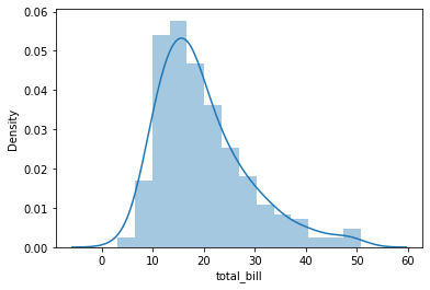
1 distplot()#
The distplot() shows the distribution of a univariate set of observations.
sns.distplot(tips['total_bill'])
# Safe to ignore warnings
C:\ProgramData\Anaconda3\lib\site-packages\seaborn\distributions.py:2557: FutureWarning: `distplot` is a deprecated function and will be removed in a future version. Please adapt your code to use either `displot` (a figure-level function with similar flexibility) or `histplot` (an axes-level function for histograms).
  warnings.warn(msg, FutureWarning)
<AxesSubplot:xlabel='total_bill', ylabel='Density'>
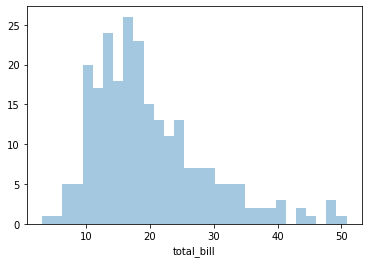
sns.distplot(tips['total_bill'],kde=False,bins=30)
C:\ProgramData\Anaconda3\lib\site-packages\seaborn\distributions.py:2557: FutureWarning: `distplot` is a deprecated function and will be removed in a future version. Please adapt your code to use either `displot` (a figure-level function with similar flexibility) or `histplot` (an axes-level function for histograms).
  warnings.warn(msg, FutureWarning)
<AxesSubplot:xlabel='total_bill'>
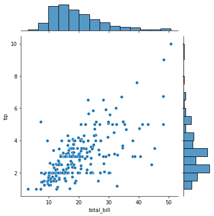
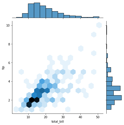
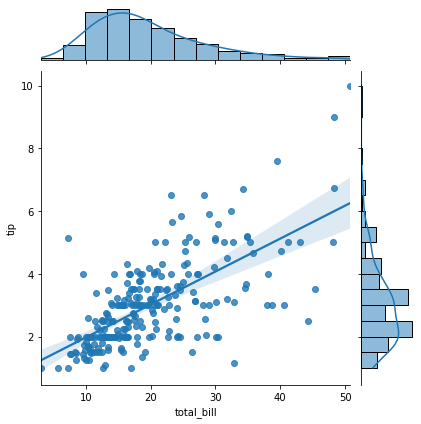
2 jointplot()#
jointplot() allows you to basically match up two distplots for bivariate data. With your choice of what kind parameter to compare with:
scatterregresidkdehex
# 'scatter'

sns.jointplot(x='total_bill',y='tip',data=tips,kind='scatter')
<seaborn.axisgrid.JointGrid at 0x1bfbe8c42b0>
# 'hex'

sns.jointplot(x='total_bill',y='tip',data=tips,kind='hex')
<seaborn.axisgrid.JointGrid at 0x1bfbd546670>
# 'reg'

sns.jointplot(x='total_bill',y='tip',data=tips,kind='reg')
<seaborn.axisgrid.JointGrid at 0x1bfbeacc8b0>
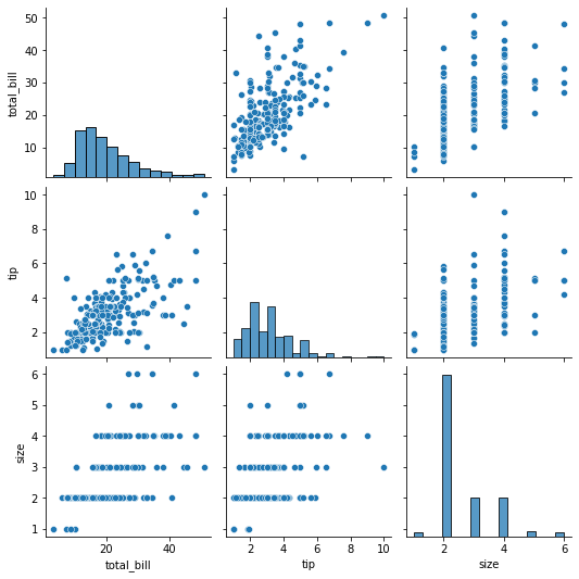
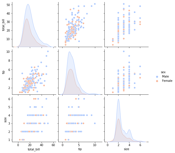
3 pairplot()#
pairplot() will plot pairwise relationships across an entire dataframe (for the numerical columns) and supports a color hue argument (for categorical columns).
sns.pairplot(tips)
<seaborn.axisgrid.PairGrid at 0x1bfbe8d2640>
sns.pairplot(tips,hue='sex',palette='coolwarm')
<seaborn.axisgrid.PairGrid at 0x1bfbf65d610>
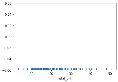
4 rugplot()#
rugplots() are actually a very simple concept, they just draw a dash mark for every point on a univariate distribution. They are the building block of a KDE plot:
sns.rugplot(tips['total_bill'])
<AxesSubplot:xlabel='total_bill'>
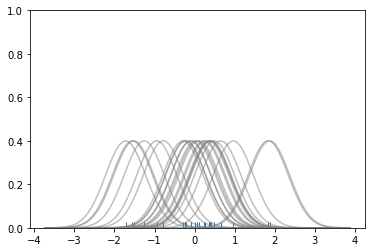
5 kdeplot()#
kdeplots() are Kernel Density Estimation plots. These KDE plots replace every single observation with a Gaussian (Normal) distribution centered around that value. For example:
# Don't worry about understanding this code!
# It's just for the diagram below
import numpy as np
import matplotlib.pyplot as plt
from scipy import stats

#Create dataset
dataset = np.random.randn(25)

# Create another rugplot
sns.rugplot(dataset);

# Set up the x-axis for the plot
x_min = dataset.min() - 2
x_max = dataset.max() + 2

# 100 equally spaced points from x_min to x_max
x_axis = np.linspace(x_min,x_max,100)

# Set up the bandwidth, for info on this:
url = 'http://en.wikipedia.org/wiki/Kernel_density_estimation#Practical_estimation_of_the_bandwidth'

bandwidth = ((4*dataset.std()**5)/(3*len(dataset)))**.2


# Create an empty kernel list
kernel_list = []

# Plot each basis function
for data_point in dataset:

    # Create a kernel for each point and append to list
    kernel = stats.norm(data_point,bandwidth).pdf(x_axis)
    kernel_list.append(kernel)

    #Scale for plotting
    kernel = kernel / kernel.max()
    kernel = kernel * .4
    plt.plot(x_axis,kernel,color = 'grey',alpha=0.5)

plt.ylim(0,1)
(0.0, 1.0)
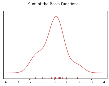
# To get the kde plot we can sum these basis functions.

# Plot the sum of the basis function
sum_of_kde = np.sum(kernel_list,axis=0)

# Plot figure
fig = plt.plot(x_axis,sum_of_kde,color='indianred')

# Add the initial rugplot
sns.rugplot(dataset,c = 'indianred')

# Get rid of y-tick marks
plt.yticks([])

# Set title
plt.suptitle("Sum of the Basis Functions")
Text(0.5, 0.98, 'Sum of the Basis Functions')
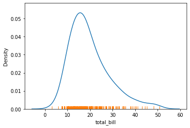
sns.kdeplot(tips['total_bill'])
sns.rugplot(tips['total_bill'])
<AxesSubplot:xlabel='total_bill', ylabel='Density'>
sns.kdeplot(tips['tip'])
sns.rugplot(tips['tip'])
<AxesSubplot:xlabel='tip', ylabel='Density'>

Alright! Since we’ve finished with Distribution Plots in our next lecture where we shall be discussing few other plots which deal quite heavily with Categorical Data Plots, that is commonly seen across.